
One of the things we get asked all the time, from designers and non-designers alike, is what the heck the difference is between a font and a typeface.
The difference between a font & a typeface is this — the typeface is the design of the letters, the concept, how the letters are drawn on paper. A font is a piece of software a type designer makes to get that drawing in your hands, on the computer, and ready to type with. A simple way to remember the difference is this — a font is a file, and that means that at it’s simplest, a typeface is the idea.
A lot of designers use these terms interchangeably, and that can sometimes be confusing, but let’s dive into why that is, how to remember it — and the important situation where it really matters.
Terminology Breakdown —
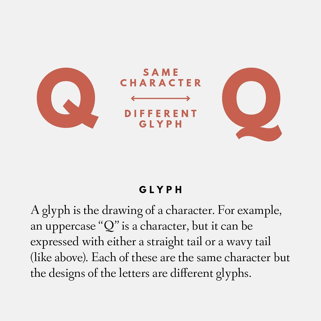
A font is made up of a bunch of glyphs — which are just a word for individual drawings of a letter/character. The glyph will have a bunch of other code built in to make it useable on your computer, but a glyph is at it’s heart, one drawing of a character.
This is where it’s useful to understand idea vs. drawing: because the idea of a character is that there’s only one in the alphabet — a Q, for instance. But in a font, you might actually have multiple glyphs for the same letter.
This could be for stylistic reasons (because a lot of designers get some value out of differently-designed Q’s), or it could be a matter of needing a letter to look different in different scenarios — there’s a lot of potential with font tech to do some amazing things, and we’ll definitely cover some of that great stuff in a different article, cuz it’s super cool & useful.
So, quick recap on important terms:
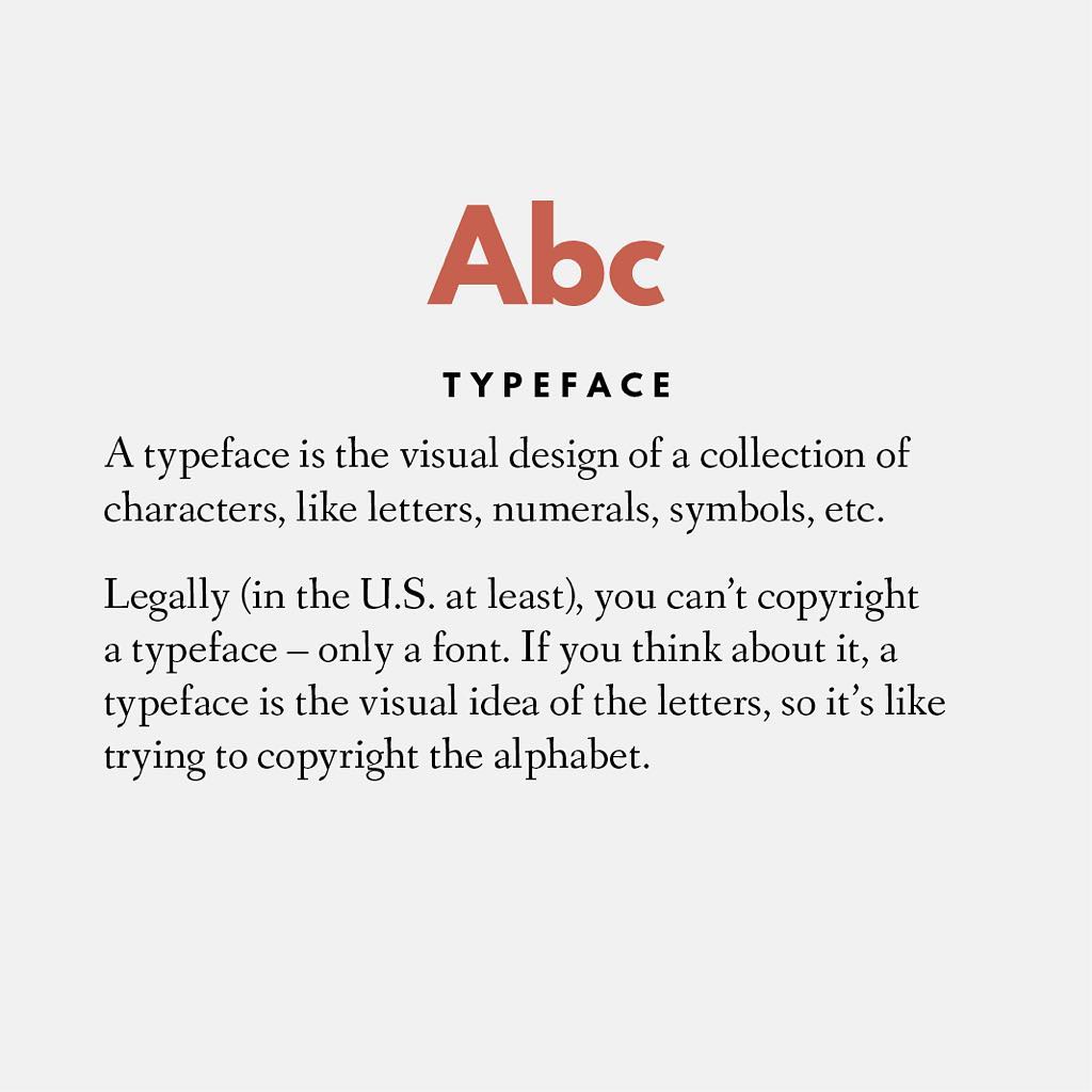
- Typeface — the idea, personality, appearance, and aesthetics of the letters
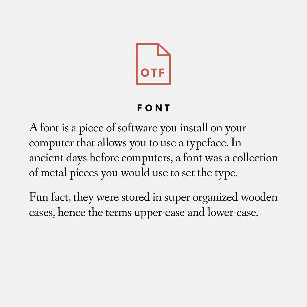
- Font — the file someone designed to make that idea real & useable
- Letter — you know, a letter
- Glyph — an individual drawing of a letter, of which there might be many
Are these words actually interchangeable?
Here’s the thing — a lot of people in design can be sticklers, which can feel intimidating. To most of us, and in most situations, it really does not matter if you use these interchangeably.
In fact, most of the professionals we know do it, too. Whichever word comes to mind, and everyone usually knows what everyone usually means.
Actually, in researching a little more on this, I found someone that posted an awesome analogy in an obscure forum somewhere:
Most of the time, people use “font” and “typeface” interchangeably, but occasionally you need to focus on one or the other, like how sometimes musicians write great songs, but release bad recordings of those songs or never record them.
That makes a lot of sense to me, I can dig that — a typeface, for example, could be ugly or weird or funny-looking and not that useful, but the font could have a ton of international characters and extra glyphs and weights, and maybe that makes it a thing you choose to use.
The one time not knowing your terminology might bite you.
Where this can actually matter a lot — besides if you’re a type designer or general type nerd, like we are — is in licensing and copyright.
As with most stuff relating to art, copyright is confusing and weird and oh-so-complicated. Fonts & typefaces are no different, and possibly worse than the norm.
Here’s a super-fun complicated detail that trips up a lot of designers who start getting into type — you can’t copyright a typeface.
“Ummmmmmmmmmmm, what?”
You can’t copyright a typeface.
The logic behind this one is kind of sound once you hear it: if a typeface is the aesthetic idea of a bunch of letters, how the heck can you copyright a letter A?
“But c’mon, it’s the drawing of the letter
A, it’s not like it’s going to be exactly the same in every typeface idea.”
This is where knowing a little type design throws a wrench in things — the design of most letters is… a fine balance of creativity and function. Ask an experienced type designer and they’ll usually be pretty upfront about it; the letter A has to look like the letter A, or no one’s gonna know what the heck to do with it.
And while type design is a undoubtedly a fine creative craft, the reality is there’s some serious knowledge of understanding what people expect out of the letterforms they’re crafting, and — this may not be what everyone talks about, but it’s true — a need to make those typefaces usable not just so they’re usable, but so they flipping sell fonts.
That’s two pretty solid reasons, combined with what I would describe from most type designers I’ve met as a strong respect for history, literature, and the psychology of how we all read text, and you’ve got kind of a solid standing on this weird cant-copyright-the-letter-A idea.
So, at least, that’s the idea behind the law — and it is the law.
It’s all about copyrighting the font.
That being said — it is 100% law that a font can be copyrighted — because a font is a piece of software under the law, it’s the same as how Adobe holds a copyright on their Creative Suite, or Apple holds a copyright on iOS.
The code that was written to bring that typeface to life in that font file is totally unique to the type designer — the way the lines are drawn, the points & how they align to the bounding box, the extra glyphs you draw and the letters you kerned all mash up into a unique chunk of code that someone installs on their computer.
So how can there be multiple versions of fonts out there — how can different foundries come out with their own Futura?
Believe it or not, these weird obscure details are exactly how we get competing fonts — since the typeface can’t be copyrighted, you are more than welcome to interpret the idea in your own way, with your own drawings.
This is how a lot of revival fonts — like a few of our own, League Gothic, League Spartan, Fanwood & the other Goudy faces in our catalogue — came to be.
This is also how things like Arial exist, or even the original Spartan that we based our own revival on; type designers take typeface ideas, reinterpret them, draw ‘em themselves and make their own versions.
What that means is that, with the exception of open-source fonts, modifying or copying directly from the font software could get you sued hard, but taking the idea and drawing your own version is legit.
While a lot of people want to call that copying, or call ‘em knockoffs — coming from the world of code & web development, I consider it a lot more like inspiration.
A thing we can all use to learn.
This post was inspired by an awesome snippet from our Insta feed: