
Typography is everywhere.
Product designers, Front End Development, and art direction all employ type in their work. Type is, after all, the atomic unit for layout — mastering the fundamentals will propel your career.
We aren’t the only ones who believe this:
“95% of the information on the web is written language. It is only logical to say that a web designer should get good training in the main discipline of shaping written information, in other words: Typography.”
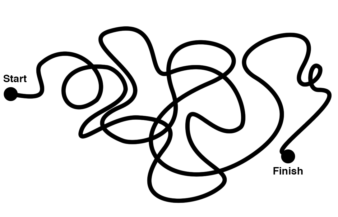
Advancing in your career requires a deeper understanding of the basics. Working with other designers and business-folk demands a more articulated knowledge to communicate effectively.
Just winging it as a junior designer may work at that time, but fast forward as an experienced designer with additional responsibilities, and you’ll realize that what worked before will not work now. You can expect misunderstanding, messiness, and ineffectiveness instead.
There’s no escaping the need to improve your ability to communicate.

Junior Designer vs. Senior Designer Process by Julie Zhuo
One of the other most common challenges for designers stems from a question we get asked constantly— how do I grow my eye for great type? What makes one font work with another, what makes one font better than another? How do I approach this in a systematic process beyond subjective whims, like “I really like this font”, with a more in-depth understanding of type?
As Bethany Heck of Font Review Journal put it:
I think a lot of the gap that exists between people who “get” type and those who don’t is because we veil so much of it in jargon and we don’t put in the effort to understand why WE see things the way we do, so we can pass that along to others. It’s so easy to fall back on gut reactions and wishy washy phrasing to describe why we like or don’t like something.
Typography takes time to cultivate an eye — hundreds of hours, potentially — but also takes guidance. It is learnable, and the question is not if you can learn typography, but rather how.
How the heck do we learn typography?
Like a foreign language, you need immersion to absorb the components, grammar, and rules of understanding. You’ll go through a predictable three phases of understanding, as Wenting Zhang of Typekit shared:
Phase One is what I called the “Over-Dramatic Phase.” In the very beginning we tend to pick those typefaces with exotic features. Those display fonts that really stand out and shout. It is a phase almost every amateur designer, like myself, who didn’t get proper training went through. It is overdramatic because my eye was not trained to see the detailed difference, but only see the big difference.
Phase Two is about being safe, professional, knowing the rules and following them. The problem of Phase Two is that one still can’t see the subtle difference between two very similar and good quality font. For example, I wouldn’t be able to tell the difference between Akzidenz Grotesk and Univers. If I picked one over the other, it is not serving any particular typographic purposes.
In Phase Three, one should be able to make intentional considerations when you pick from very similar typefaces. One might consider if two typefaces come from the same period in history or they have the same vibe, or they have the same x-height, or simply this curly leg R works better with the other typeface. You’re definitely more aware when you make those typographic choices and design decisions.
So far we have discovered:
- Typography is essential to your effectiveness in design. But the technical terms can be a huge roadblock.
- It is a learnable language of progressively deeper understanding. But the process on how to proceed can be super unclear.
- Getting past the technical and visual roadblocks will take considerable attention and time to develop, and is even harder without a guide.
To improve your communication in design, your ability to combine the right pieces at the right time, and understand what you’re doing deeply, you have to learn the fundamentals of typography yourself.
It’s hard to find great resources on getting started with type design. The books are either too much detail, or not enough, and let’s be honest, the number of books you can even buy on type design could fit on the smallest bookshelf you own. Even online tutorials are far, and few between, and often don’t give you a complete picture of beginning-to-end, nothing-to-finished-typeface.
So you can learn this, messily, and waste countless hours — hunting down technical terminology, reading obscure and outdated books, interviewing experts, practicing non-stop, watching tutorials from the far and dangerously difficult-to-find corners of the web.
Or you can take the direct, efficient path.
Our Pitch — How We Can Help
We’re launching our first course through The League — Type Design 101. Made for you. Live and online.
We’ve taken a lot of time to pour over what to include, how to teach it, and in what order we think will be the most useful for you to learn it.
- A methodical process to understanding type that focuses doing rather than talking.
- Removing unnecessary jargon or technical limitations.
Somehow, we’ve whittled it down to a very concise, very precise 12-week course, jam-packed with an amazing combo of thoughtful lessons, practical demonstrations, and real-life, you-actually-create-stuff-and-make-progress-on-your-own-font activities and homework.
We’ve broken it up into 4 distinct sections, each with a different but important focus for people who need different things, and each building on the last to make a complete course.
The First Foundations
A free introduction to type design
The first 3 weeks are useful for anyone who’s even interested in understanding the concepts behind letters and fonts. We provide a handful of free cheatsheets before you even start, so that we can hit the ground running from the very first session — an intro to software, anatomy, and drawing.
Learning Lettering
includes First Foundations
In these 3 weeks, you’ll go from anatomy to prototype. We’re going to teach you how to start, which letters will get you the most benefit the quickest, and how to approach drawing strategically.
The important part to understand is that you’ll be doing more than anything else. You’re here to make type, and we’re here to show you how and give you feedback. You’ll be tuning in to live videos each week, where you’ll be following along as we demonstrate & draw in realtime.
And then the real work comes from you working on your own project between each week. We’ll use your and your classmate’s work each week to critique, showing everyone how to improve drawing, design, and fundamental letterforms practically.
The concepts of these first two tiers equip you with the mindset and techniques (and tech) to rapidly achieve awesome, effective, professional-quality lettering, and gives you good fundamentals to go forward.
Beginning Type Designer
includes First Foundations + Learning Lettering
While you get great foundations with the first two tiers, you’ll end up with only a handful of the beginning characters in a full font — that’s perfect for what some folks are looking for, but maybe you’re interested in making it complete.
In these next 3 weeks, you’ll be going from prototype to font. You’ll discover how to re-use the work you learned in the first two tiers pragmatically, re-using pieces, learning new professional techniques to expand your characters into a full lowercase & uppercase set, with punctuation & symbols. We’ll be moving fast, but by now you’ll have learned techniques, gotten critiques and feedback from us and your classmates, and will be more confident in drawing, moving quicker, and seeing your letters as a system that works together.
We’ll include professional type design proofing sheets that we ourselves use to test characters with your eyes, off-screen, for free. You’ll get more detailed feedback, more fine-grained critiques, and we’ll be holding your hand less — to show you that you ride your own typoraphic bike yourself. You’ll walk away feeling like you can make an entire font. Because you’ll walk away with an entire font, that you designed yourself.
Mastering Your First Font
includes First Foundations + Learning Lettering + Beginning Type Designer
For those of us who are serious about taking this craft to the next level, for those of you want to publish your font, distribute your font, and — even better — sell your font, we’re offering this final, crucial piece just for you.
Besides getting a slew of important benefits — like more detailed, professional proofing sheets for free, a smaller group of similar peers to critique with, and more direct access to personal instructor feedback on yourwork, there’s an unmatchable benefit to following through completely in mastering.
Mastering enables you to start selling your fonts.
Of course, there’s plenty that goes into selling besides just mastering, but we’ll be teaching you what you need to submit your fonts to places like MyFonts, Google, and even The League itself.
Let alone the understanding you need to sell fonts yourself, making sure they’re professional quality. With the right strategy, following through to the end could give you the tools to help you earn back the amount you’re spending to learn — and start a career for yourself as a type designer.
There’s a lot of finesse that goes into a professional-quality typeface, and if you’re interested, we want to teach you everything. These last 3 weeks will focus heavily on your font, critiquing your system, and helping you learn some of the finer finishing techniques that will kick it up a notch.
And of course, the biggest win of these last few weeks is that you’ll get personal, hands-on mentorship from us specifically on your work. You’ll have professionals critiquing your stuff each week, helping you get exactly where you need to be.
Next Steps
We’re opening doors to our course on the 27th of November, at 9am EDT. It’ll only be open for a limited time, so we want to make sure anyone who’s really passionate about this can join us.
It’s a live course, on a set schedule each week, complete with very hands-on lessons, and live, interactive critiques directly with your teachers and peers.
And to follow up this post, we’ll be sharing a few detailed posts in the coming weeks— so you can learn how exactly the First Foundations segment we’ve designed, along with some important snippets you’ll learn inside it, will dramatically improve your understanding of type, literally for free.