Your new favorite weekly design podcast — for nerds who love talking type as much as we do.

The Weekly Typographic Podcast is our weekly newsletter + podcast combo — where we collect neat, new, and interesting type & design-related links, and then talk about them each week with extra insights.

It always leads to some fun discussion — and we make room every week for our old-fashioned Nerd Alert section, diving deep into a fascinating topic you won't hear anywhere else.


A special thank you to our current main podcast sponsor Adobe, who's supporting us creating these every week. If you're interested in supporting us, too, we've got details of the benefits you get as a sponsor on our contribute page.


Bonus Episode

S4E5 - Kili, Originality, and Calendars 📅

A wild ride this week — from chatting about Clippy-esque rebrands, to conceptual UX and calendars, to the fine line between a font revival and copying someone's work.

Weekly Typographic Newsletter Links

Join 0+ fellow type lovers:

Get the podcast, design resources, & type news in your inbox every week.

Our next newsletter ships in and 0 seconds— join now to get it!

Bonus Episode

A little note from our founder ✨

We interrupt your regularly scheduled link-chat to talk a tiny bit about where The League came from — and ask an important question.

Weekly Typographic Newsletter Links

Bonus Episode

S4E4 - Recraft, Grid Levels, and Surveyor 🗺️

This week, in a bit of a rapid-fire episode, Thomas and Micah chat about a handful of cool tools, inspiration, and detailed type design articles that landed on our doorstep this week!

Weekly Typographic Newsletter Links

Bonus Episode

S4E3 - Abstract, Berlow, and Color 🎨

This week, we dive into some fun articles on ASCII art & fonts, the grandfather of type's (David Berlow) catalog getting acquired by Monotype, and a bunch of fun chat about reto-futuristic design and color.

Weekly Typographic Newsletter Links

Bonus Episode

S4E2 - StyleDrop, Tank-Man, & The Olympics 🏊🏻

Extremely excited to share this week's podcast episode with you — Micah & summer co-host Thomas Jockin talk about all the cool links we shared this week, plus a little something extra. Tune in!

Weekly Typographic Newsletter Links

Bonus Episode

S4E1 - Origins, Upgrades, and Gushers 🍬

This week, Micah will be back, joined by our summer guest co-host, Thomas Jockin, to nerd out, talk type, and discuss all the links from this week.

Weekly Typographic Newsletter Links

Bonus Episode

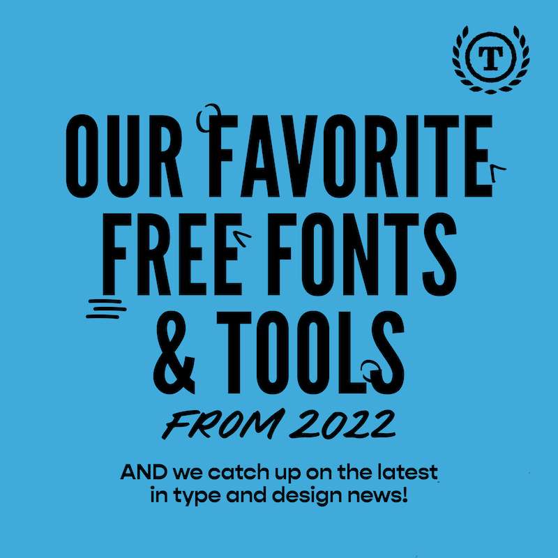
S3E18 - Our favorite free fonts and tools of 2022

🎶It’s the final countdown, do do do doooooo….🎶

For our final newsletter and podcast for the year we’re talking about our favorite free finds of the year, featuring resources, fonts, and tools. We each picked one or two things we liked (or something we wanted an excuse to talk about again) and collected them here for you. There’s democratized design tools, a couple of fun fonts, and a big old list of other resources for you to save. Phew.

That’s a wrap for 2022! What a year. A wild one of AI and gloopy fonts. We can’t wait to see what 2023 brings up.

We’re taking a break until Feb, so we’ll see you in the new year. We hope you’re taking a break too and enjoying the fun things of winter (in the northern hemisphere) or summer (in the southern hemisphere), and celebrating whatever you celebrate with whoever you most like celebrating with.

Most of all, thanks for all of your wonderful support this year. For coming to workshops, sending us links to check out, tagging us in stuff, listening to the podcast, reading the emails, and generally being part of the gang. We appreciate you!

Micah, Olivia, and Steph x

PS. If you’ve seen something over the break that you want us to see, send it our way. You can find us @theleagueof on instagram and twitter.

Weekly Typographic Newsletter Links

Bonus Episode

S3E17 - Our favorite share-worthy reads of 2022

Friends! We are fast approaching the end of the year, which means we get to start our traditional episodes of sharing some fam favorites from the year.

This week we’re sharing some articles that we loved reading, thinking, and talking about this year and have been noodling on ever since we first saw them. We’re revisiting death metal logos (which was one of your fav episodes too), genderless design, the Olympics rebrand, and our friend, OK.

Next week it’s all about our favorite fonts and cool tools for the year. So keep your peepers peeled for that one.

If you’ve seen something that you think we should talk about, let us know! Hit us up on Twitter or Instagram. You can find us @theleagueof on both platforms.

Weekly Typographic Newsletter Links

Bonus Episode

S3E16 - 2022 Retrospective

There’s a bit of a theme to this week’s articles, with a bit of a ‘using type on the web’ flavor to our links and discussions. Which is good because we get to pick Micah’s brain on some of these subtleties and clever tips on using type well in web designs.

As we move into the end of the year (how?!) we’re doing a few end-of-year-y conversations. Starting with this one, which is a bit of a retrospective on the 2022 year in design. We’re revisiting the Monotype Type Trends report to see what came true, chatting about what we’ve seen in the world, and what we’ve been surprised about over the last 12 months. Let us know if you’ve seen something different - we’d love to know.

If you’ve seen something that you think we should talk about, let us know! Hit us up on Twitter or Instagram. You can find us @theleagueof on both platforms.

Weekly Typographic Newsletter Links

Bonus Episode

S3E15 - Adobe Fonts Deep Dive

Hands up if you enjoyed our conversation with DJR last week. It’s proving a popular episode - thanks for listening, we hope you enjoyed it.

This week we’ve got some fresh new links to talk about, and a nerd alert that segues from last week’s interview. We’ve got some rather beautiful examples of 3D lettering created by a text to image AI generator, a riff on color fonts, UI chats, and a cool bespoke typeface out of Brazil.

Our big nerdy chat this week is all about Adobe Fonts. The good, bad, and ugly of the evolution from Typekit to Adobe Fonts and how some of the mechanics work behind the scenes if you’re a designer putting fonts into the catalogue.

As usual, if you’ve seen something that you think we should talk about, let us know! Hit us up on Twitter or Instagram. You can find us @theleagueof on both platforms.

PS. No podcast next week as we’re taking some time off for the holiday weekend here in the US, but we’ll still drop into your inbox to give you something to read between servings of pie. 

Weekly Typographic Newsletter Links

Bonus Episode

S3E14 - An interview with David Jonathan Ross

We’ve said it before and we’ll say it again; the conversations we have with people from around the type and design industry make our hearts very happy. And this week is another example of that as we got to talk to the one and only David Jonathan Ross, or DJR. He shares his insights on what’s happening in the type world, how he runs his type design business, and much much more. It’s a fun conversation, we hope you love it too.

We’ve also got articles and things for you to read. A hot tip from DJR, a cool piece of type merchandise / marketing, an early 2023 trends list, and some interesting changes to categories at the Type Director Club awards.

If you’ve seen something that you think we should talk about, let us know! Hit us up on Twitter or Instagram. You can find us @theleagueof on both platforms.

Weekly Typographic Newsletter Links

Bonus Episode

S3E13 - Emerging Type Tech Tools

Over the last couple of months, we’ve come across a few fancy new tools and tech for designers / type designers that have had us talking. So this week, we’ve packaged all of those up in a nice box and presented them to you as an audio (and newslettery) gift.

There’s some thoughts on AI+type, a serious upgrade to an existing type-creation tool, new things to make 3D design with, a super cool tool for making handwritten type, and a typeface funded by the future.

If you’ve seen another emerging tech tool that you think we should have included, tell us! Hit us up on Twitter or Instagram. You can find us @theleagueof on both platforms.

Weekly Typographic Newsletter Links

Bonus Episode

S3E12 - So you want to distribute a font?

We’ve been talking and thinking a lot lately about the different routes for designers who design type, but aren’t necessarily wanting to be full-time type designers. Do you need to start a foundry? How do you get your type out there? Do you have to distribute via one of the big platforms like Google or Adobe? (Spoiler alert: the answer to all of these questions is no). We’re talking about this more this week in a nerd alert all about novel ways of distributing fonts.

There’s also a few articles to enjoy. Two historical institutions had type-heavy rebrands, Libbie Bischoff has a new typeface in progress, and we looked at an article that celebrates our favorite two letters; OK.

You know what to do - if you’ve seen something cool on the internets that you think we should be talking about, hit us up on Twitter or Instagram. You can find us @theleagueof on both platforms.

Weekly Typographic Newsletter Links

Bonus Episode

S3E11 - Tattoo Lettering

We’re back on our regular schedule after last week’s fun detour to collaborate with the Interrobang podcast (if you haven’t listened to that one, it’s a fun one, so make sure you scroll back a week in your podcast player to give it a listen).

This week we tried to get into spooky season mode, but the closest we got was tattoos, which took us down a pretty interesting route looking at the skill overlap between tattoo artists, letterers, and type designers and the different challenges when you’re working on a ‘skin canvas’ versus a digital or (non-living) physical canvas.

We’re also talking about the role of designers in designing for good when it comes to technology use and mental health, looking at a clever Twitter thread, and enjoying a new custom typeface for Braun.

You know what to do - if you’ve seen something cool on the internets that you think we should be talking about, hit us up on Twitter or Instagram. You can find us @theleagueof on both platforms.

Weekly Typographic Newsletter Links

Bonus Episode

S3E10 - Weekly Typographic x Interrogang

Do not adjust your sets! We are coming to you this week with a very special (early) episode with our first crossover episode. And we couldn't be happier with this crossover as we're talking to the delightful and equally-as-nerdy-about-typography, Kyle and Josh from the Interrogang Podcast.

cue applause

We mashed up our respective podcast formats - Kyle and Josh brought two great links about new type releases, and we offered up two articles on how type is being used in the world in two rebrands. We loved the different perspectives and metaphors that Kyle and Josh bring to the conversation.

After the links, we dive into a nerd alert talking about the ways that type designers can get their type out there, in particular new ways of producing and marketing type and whether you really have to start a foundry if you’re making type on the regular.

We had a blast, we hope you enjoy this conversation too. And if you did, you can let us know! Find us on Twitter or Instagram @theleagueof on both platforms, and catch Kyle and Josh on Twitter @proof_and_co.

Weekly Typographic Newsletter Links

Bonus Episode

S3E9 - Packaging Design Storytime

Settle down children, and pull up a comfy seat - it’s story time.

Join Olivia and Micah in the reading corner for this week’s nerd alert where Olivia is talking all about the world of packaging design. She shares her early experience of doing bespoke event packaging, and then moving into more commercial packaging where she learnt all of the intricacies, politics, and legalities of big-brand packaging design. As usual, there’s also practical tips if you are doing packaging design, or would like to add it to your design repertoire.

As usual, we also chat about some other links and fun things. Monotype have gobbled up another collection of typefaces, our friend Elliot Jay Stocks has shared his experience of moving his website to use variable fonts, there’s some chatter about blocking web fonts for privacy reasons, and the London Fire Brigade have a charming new custom typeface.

You know the drill - if you’ve seen something cool on the internets that you think we should know about, you can let us know on Twitter or Instagram. You can find us @theleagueof on both platforms.

Weekly Typographic Newsletter Links

Bonus Episode

S3E7 - An Interview with Beatriz Lozano

We’re having a chat with another designer this week, and we’re super excited that that designer is the wonderful Beatriz Lozano [insert cheers and whooping here]. We’ve been such fans of Beatriz’s work and approach for a long time, so we loved picking her brain on all things tech, design, education, plus a peek into the future 👀🔮.

Of course, we’ve also got some cool links for you to check out over your Friday morning coffee. There’s the weird and wonderful world of the Pangram Pangram Lab, a handy UX article about the infamous infinite scroll, a cool project cataloguing Chinese type, and an interview with a type designer about the role of typography in the design process.

As usual, if you’ve seen something cool on the internets that you think we should know about, you can let us know on Twitter or Instagram. You can find us @theleagueof on both platforms.

Weekly Typographic Newsletter Links

Bonus Episode

S3E6 - 3D Type Showcase: A Brave Neue World

Every so often we like to take a longer look at a certain type/design style or part of the industry. We’ve been seeing a lot of interesting 3D design pop up recently, both in the real world and in the overlayed world of AR so we wanted to get a little bit deeper to take a peek at different applications of this field. There’s some amazing artists doing such creative work, we’ve picked five to have a look at and a chat about this week; Alex Valentina, Rajshree Saraf, Vincent Wagner, Mora Vieytes, and Noah Camp. So grab a coffee, sit back and enjoy the eye candy and brain explosions…

If you’ve seen something cool on the internets (whether in 3D or any other dimensions!) that you think we should know about, you can let us know on Twitter or Instagram. You can find us @theleagueof on both platforms.

Weekly Typographic Newsletter Links

Bonus Episode

S3E5 - Trial Fonts and Tribulations

This week Olivia is joined by Steph and they are having a big old chat about trial fonts; what we like about them, what annoys us about them, their possibilities, and some of the creative ways foundries are using them / thinking about them as part of their marketing plan. (If you’ve got strong thoughts on trial fonts - we’d love to hear them, hit reply and let us know!).

As usual, we’re also talking about some type and design news. We chat about Katy Cadwell’s new NDA Podcast, and her recent episode about the highs and lows of comments on design websites and some fascinating behind the scenes insights from designers and platform owners. We pop in on our friends at I Love Typography to look at their recent article on fonts for books (which has lots of foundries and designers we weren’t familiar with), hop over to Chile to read about the Chilean typography scene guided by Franco Jonas, and then admire a rather nice piece of brand design on what is a rather serious financial service; life insurance.

You know the deal; if you’ve seen something cool on the internets that you think we should know about, you can let us know on Twitter or Instagram. You can find us @theleagueof on both platforms.

Weekly Typographic Newsletter Links

Bonus Episode

S3E4 - Maximizing Marketing: Taking Your Type to the People

There’s a bit of everything in this week’s newsletter and chats; a super detailed behind the scenes on an iconic rebrand, some handy web design typesetting tips, a case study of alternative design education options (and the importance of practice), and a cool look into some left-handed calligraphic design.

This week’s nerd alert was inspired by Commercial Type’s recent interesting marketing/advertising approaches. There was a wheat-pasting campaign around New York City, and some rather bright placards popping up around a European cycling event. The natural habitat of typical font-purchasers and design enthusiasts? Maybe not. A good example of thinking laterally about your marketing? Maybe…? We also talk about some of the more ‘traditional’ approaches of type marketing, but we’d love to know if you’ve seen any other really creative / alternative approaches to marketing of typefaces/foundries.

You know the deal; if you’ve seen something cool on the internets that you think we should know about, you can let us know on Twitter or Instagram. You can find us @theleagueof on both platforms.

Weekly Typographic Newsletter Links

Bonus Episode

S3E3 - An Interview with Libbie Bischoff, Founder of Type Du Nord

We’re not going to lie, one of the things that gives us the most energy is talking to type designers / people working in the type and design industry. Our cups are overflowing this week after a delightful conversation with Libbie Bischoff.

We spotted Libbie’s amazing 52 Fonts project early this year and were blown away by her dedication and persistence to putting out a new font every week. We couldn’t wait to get her on the podcast to talk about why she chose to do this(!), how she structured her design process, and how she stuck to it. She shares all of these juicy details and more, including the process of transitioning into running her foundry (Type Du Nord) off the back of this project. We are full of admiration.

There’s also some things for you to read, including a heap of recent font releases, a stack of new sources for free fonts (woo!), a cool typography project happening as part of SVA’s 100 Days project, and an example of a foundry using DALL-E for their marketing materials.

You know the deal; if you’ve seen something cool on the internets that you think we should know about, you can let us know on Twitter or Instagram. You can find us @theleagueof on both platforms.

Weekly Typographic Newsletter Links

Bonus Episode

S3E2 - DALL-E 2: Are we all out of jobs?

It’s so good to be back in recording mode, and this week we took it to the next level by recording IN THE SAME PLACE! Olivia took a lil road trip to see Micah and they recorded together. Cute.

This week we’re talking about DALL-E; what it is, why it’s useful, why it’s not, the things people are worried about, and why we’re not worried about (all) of the worries. This week’s podcast cover image was generated by DALL-E… you’ll have to listen to the episode to find out what the prompt was though.

We’re also talking (/ranting) about genderless design and also an interesting open-source decision from Microsoft.

Don’t forget to grab a ticket to this weekend’s workshop (it starts tomorrow!) all about bettering your vectoring skills - super useful beyond just type design. As usual, if you can’t make it live you’ll receive the recording… but only if you sign up!

You know the deal; if you’ve seen something cool on the internets that you think we should know about, you can let us know on Twitter or Instagram. You can find us @theleagueof on both platforms.

Weekly Typographic Newsletter Links

Bonus Episode

S3E1 - It's Season 3 (baby!)

FRIENDS! WE'RE BACK! And not only are we back on the podcast, but we're 'back to school' as we have a new workshop happening later this month with the wonderful Aline Kaori. On the podcast Micah and Olivia are talking about what we've been enjoying this summer, what we're seeing around the type & design world, and some sneak peeks into what's coming up in season 3 of the Weekly Typographic podcast; interviews, deep dives, trips into the future, and some fun surprises... TBH we're amazed this episode isn't three hours long, we've got so much to chat about after our break. As usual, there's also some articles for you to enjoy that we're chatting about on the podcast. Including a look into the history of Faux Hebrew fonts, the future of web fonts, the under-appreciated use of type in healthcare settings, and a fun type + textiles project.

Weekly Typographic Newsletter Links

Bonus Episode

S2E88 - Season 2 wrap!

It’s the end of season 2! There’s exactly zero rhyme or reason to when we call time on a season (see the fact season 1 was about three months, and season 2 has been over two years), but we’re taking a break for a few weeks over the summer and will be back with a refresh/glowup*. But, wipe those tears away our friends, we’ll still be dropping into your inbox each week with your usual fix of type and design news and reviews.

We’re seeing out season 2 with a throwback of our old episodes where we just talk about the links. To be honest, we probably could have just talked about the first link for an hour; the new Instagram branding. Strap yourself in for some thoughts on this. In less controversial topics, we’re also talking about some handy font analysis tools, the ‘trend’ of anti-design, looking at some lovely type Inso from a 36 days of type project, and enjoying a new (to us) nerdy resource about the history behind logos.

As usual, if you’ve seen something cool on the internets that you think we should know about, you can let us know on Twitter or Instagram. You’ll find us @theleagueof on both platforms.

or winter, for our Southern Hemisphere pals *are the kids still talking about glow ups? Asking for a friend…

Weekly Typographic Newsletter Links

Bonus Episode

S2E87 - An interview with designer and educator Juan Villanueva

We’re just going to say it. We love Juan Villanueva. So we’re especially happy to have him joining us on the podcast this week for a chat about type design (of course), the changing landscape and opportunities in type design education, and his multitude of roles and contributions to the type community. There’s heaps of good stuff in this interview, and we hope Juan is your new typographic BFF afterwards too.

Your weekend reading includes some handy tips for freelancers, a niche design collection of rave club membership cards, a typesetting game, and a new playground for experimental fonts and font technology. Juicy.

As usual, if you’ve seen something cool on the internets that you think we should know about, you can let us know on Twitter or Instagram. You’ll find us @theleagueof on both platforms.

Weekly Typographic Newsletter Links

Bonus Episode

S2E86 - Web3: what we've learned so far

We’ve been teasing this topic for MONTHS and we’ve finally pulled together all our learnings so far about web3/NFTs to make an episode. This will be part 1, as after our summer break we’re going to bring you an interview with an expert and/or creator in this field to dive deeper into it. So think of this week as your amuse-bouche, covering the potential for web3 as creators, but also some of the (significant) problems with it.

The other fun articles we’re chatting about include handy UX/UI tips, beautiful Arabic book design, and the specifics of merchandise design.

As usual, if you’ve seen something cool on the internets that you think we should know about, you can let us know on Twitter or Instagram. You’ll find us @theleagueof on both platforms.

Weekly Typographic Newsletter Links

Bonus Episode

S2E85 - Episode 100!

We did it!! We made it to episode 100! We’re taking a little trip down memory lane this week and sharing some of the origin stories that you might not know about your favorite(!) type and design news podcast. And you have to listen to hear a clip from the first ever Weekly Typographic episode that Micah and Olivia recorded IN A CAFE. We cannot. Not gonna lie, this is a very wholesome episode.

Along with looking into the past, we are also sharing news and links from the present. We’ve got yet another outstanding microsite from Grilli Type, a funky design/type project that tackles emotions, some actual science exploring ageist fonts, and a tasteful way-finding project. There’s something for everyone.

As usual, if you’re seen something cool on the internets that you think we should know about you can let us know on Twitter or Instagram. You’ll find us @theleagueof on both platforms.

Weekly Typographic Newsletter Links

Bonus Episode

S2E84 - Designing a custom font for UI: The story of Spline Sans

It’s another special interview episode! This week type designers Eben Sorkin and Mirko Velimirovic join us for a chat. They are two of the creators behind Spline Sans; a new grotesque sans serif family purpose-built for UI interfaces. We ask Eben and Mirko all the deets behind creating a UI-focused typeface, some of the experiments they ran along the way, and the collaboration process. It’s a nerdy and detailed conversation, we think you’ll enjoy it too.

Check out Spline Sans on Google Fonts!

Bonus Episode

S2E83 - The realities of open source

This week’s newsletter is pretty much one big ball of wholesome goodness. There’s a fun retro project, a super detailed article about variable fonts, a designer shaking up the Arabic type education space, and a wonderful short film about an icon of hand lettering / sign writing.

In the nerd alert we’re getting into the guts of what it really means to exist in the open source space. The highs, the challenges, the fun, and the opportunities. Olivia grills Micah on all of the open source things, and we’re also putting out a little call out to the community for some extra help in running the back-end of the open source part of the League, so make sure you listen for more deets.

As usual, if you spot anything cool on the internets that you’d like us to chat about, hit us up on Twitter or Instagram. You’ll find us @theleagueof on both platforms.

Weekly Typographic Newsletter Links

Bonus Episode

S2E82 - An interview with Chris Skillern of Tulsey Type

One of the things we really love about doing this podcast is the opportunity to chat to type designers, and especially newer designers who are doing their own thing with type design. This week we’re delighted to chat with Chris Skillern, from Tulsey Type.

You might recognise Chris’ name from the TypeWknd21 round up episodes last year, as we really enjoyed his talk about the Cherokee syllabary. We catch up with Chris to find out about his experience completing the online Type West course, his tips for creativity and type design, and what he’s working on now.

We’ve also got some links for you to enjoy too; an interesting font and browser extension project focused on low vision legibility, a logo that redraws itself, a cool resource for designers impacted by the pandemic, and a cool tiny design project.

As usual, if you spot anything cool on the internets that you’d like us to chat about, hit us up on Twitter or Instagram. You’ll find us @theleagueof on both platforms.

Weekly Typographic Newsletter Links

Bonus Episode

S2E81 - A point in time: the history of type sizing

We’re back to some nerdy nerdiness in this week’s episode, featuring a nerd alert all about the weird and wonderful history of type sizing systems. If you want to be able to tell your pica from your bourgeois, then make sure you wrap your ears around this week’s episode. All bases are covered in week’s articles where you’ll find a bit of branding, a bit of trend-spotting, a bit of creative collaboration, and a bit of designer behind-the-scenes. Fun!

As usual, if you spot anything cool on the internets that you’d like us to chat about, hit us up on Twitter or Instagram. You’ll find us @theleagueof on both platforms.

Weekly Typographic Newsletter Links

Find out more at http://podcast.theleagueofmoveabletype.com

Bonus Episode

S2E80 - Five Indie Foundries to Follow

It’s Good Friday, and whether you celebrate the Easter holiday or not, we thought we’d use the long weekend as a good excuse to celebrate some indie foundries that you should put on your radar. We’ve each picked a foundry that we’re into at the moment, and are talking about them on the podcast. We also asked our friend Tré Seals what foundries he’s enjoying following at the moment, and true to form he sent us a huge list! If you’re a member, you’ll see more of Tré’s suggestions in the member fonts section of the newsletter this week.

As usual, if you spot anything cool on the internets that you’d like us to chat about, or want to alert us to any indie foundries you’re admiring right now, hit us up on Twitter or Instagram, you’ll find us @theleagueof on both platforms.

Weekly Typographic Newsletter Links

Find out more at http://podcast.theleagueofmoveabletype.com

Bonus Episode

S2E79 - Type Design School Round Up

Lots of nerdy goodness this week, and don’t worry, no April Fools gags here - just good, honest typographic fun. We’re looking at a cool open source tool that fixes some of the pain of ragging your web type, and finding out about a designer with a background in graffiti and who uses this skill in their typographic and design work. We’re also reading about two really cool revival projects; one out of France presented by the awesome folk at Velveteen, and one by Brandon Nickerson, which was an accidental typeface born out of a logo project.

For this week’s Nerd Alert we’re chatting about type education. In this first part of a few conversations we want to have about this topic we’re looking at formal type education schools. We’re talking about some of the ‘big’ names you often hear thrown around (Type @ Cooper, TypeWest, Type Paris, Reading, and The Hague), and talking about the differences between them, and why a formal program might be a good idea for someone. We’re going to follow this up with an episode about more self-directed, virtual, and shorter options, so keep your eyes and ears peeled for those.

As usual, if you spot anything cool on the internets that you’d like us to chat about, hit us up on Twitter or Instagram, you’ll find us @theleagueof on both platforms.

Weekly Typographic Newsletter Links

Find out more at http://podcast.theleagueofmoveabletype.com

Bonus Episode

S2E78 - Font Pairing Pitfalls

We’re hopping all over pop culture, tech, and some nerdy education this week. We’re looking at a very cool new free tool to create your own experimental typography, some intricate design changes of Google’s Canary icon, the typographic beauty and attention in Wes Anderson’s latest film, and a very informative video lecture about type pairing and categorization. Plus, if you listen to the podcast you’ll find our how going on dates can help improve your description of typographic terms for non-type nerds. We know you come here for the typography content, but you stay for the life advice.

For this week’s Nerd Alert we’re joined by Oliver Schöndorfer from Pimp My Type who’s sharing the three pitfalls on pairing fonts that he sees people trip up on all the time (we were nodding furiously at all of them). This is a little teaser in advance of our next workshop, happening over the first weekend of April, where Oliver will share even more juicy details on taking the pain away from pairing. You’ll also have a chance to practice some pairing and get feedback from Oliver if you join us live. Make sure you grab your spot.

As usual, if you spot anything cool on the internets that you’d like us to chat about, hit us up on Twitter or Instagram, you’ll find us @theleagueof on both platforms.

Weekly Typographic Newsletter Links

Find out more at http://podcast.theleagueofmoveabletype.com

Bonus Episode

S2E77 - Trendy Type

All your dreams have come true. We’re doing a workshop about pairing AND we’re doing it with the wonderful Oliver Schöndorfer. That’s right, the topic that drops into our inbox the MOST is how to get better at pairing type, and we couldn’t think of a better person to partner with for this topic than Oliver from Pimp My Type. It’s happening over the first weekend of April, and there’ll be juicy information plus a chance to practice some pairing and get feedback from Oliver if you join us live. So much good stuff.

We’re feeling trendy this week so are talking about some looks that are emerging and evolving in design / typography at the moment. Starting with Monotype’s 2022 trend report (make sure you listen to the podcast to get a sense of how underwhelming we found this year’s report), and then looking at the 80s revival happening in brand and campaign work. We then cheer ourselves up by looking at some super inspiring indie foundries from around the world, and an upcoming educational event being run by our friends at I Love Typography.

As usual, if you spot anything cool on the internets that you’d like us to chat about, hit us up on Twitter or Instagram, you’ll find us @theleagueof on both platforms.

Weekly Typographic Newsletter Links

Find out more at http://podcast.theleagueofmoveabletype.com

Bonus Episode

S2E76 - Book Design Storytime: From Front Cover to Back cover

Friends! We’ve got another workshop happening soon. No spoilers yet, but keep your peepers peeled next week for more juicy deets. Clue: it’s a topic that people request in our inbox all. the. time. 👀

This week’s articles are a fun mix of goodies; a typeface saving us from the horrors of trying to fit type onto a curve, Mexican designers rethinking gendered language through the power of type design, a fresh twist on Roboto, and some cool lessons from a Twitter thread about designing for dark mode (and, if you listen to the podcast, you might learn a new word when Micah and Olivia talk about that).

Grab your blanket and find a comfy spot on the floor, because Nerd Alert is story time this week. Olivia is telling us all about book design and publishing; the process, some of the quirks and considerations of designing for books, and how a book goes from manuscript to something you hold in your mitts. Super design/process nerdy and interesting. We love.

As usual, if you spot anything cool on the internets that you’d like us to chat about, hit us up on Twitter or Instagram, you’ll find us @theleagueof on both platforms.

Weekly Typographic Newsletter Links

Find out more at http://podcast.theleagueofmoveabletype.com

Bonus Episode

S2E75 - Geography typography

Whoop! We had a great workshop with Thomas Jockin earlier this week talking everything about the pitch. We not only talked about pitching custom type to your clients or your boss, but got into pricing, positioning, and turning existing clients / relationships into ongoing clients. Good stuff.

We’ve got plenty of fun stuff in this week’s podcast episode (and not just Micah and Olivia’s attempts at British and Australian accents). We’re going around the world in five typefaces as we look at type design examples where designers have had to design a typeface that becomes part of the visual identity for a city, or even a whole country! So many great examples, and we love it when studios/designers do detailed write ups of their process.

As usual, if you spot anything cool on the web that you’d like us to chat about, hit us up on Twitter or Instagram, you’ll find us @theleagueof on both platforms.

One of the weekly member perks is a little selection of handpicked fonts we find for you. This week we’re sharing fonts from Ukrainian foundries Mint Type, Valentyn Tkachenko, and Kyiv Type Foundry. We’ve picked some specific fonts for members, but thought you might want to go check out these foundries too, and support creators in the Ukraine.

Weekly Typographic Newsletter Links

Find out more at http://podcast.theleagueofmoveabletype.com

Bonus Episode

S2E74 - How to start a revival project

It’s almost time! Next week we’re talking custom type pitching at our next workshop with guest instructor Thomas Jockin. Thomas is joining us to share his lessons, structures, and processes for successful custom type design pitches, and we reckon that these lessons would be useful for other design disciplines too, not just custom type. Don’t miss out, register for your space and if you can’t join us live, you’ll get a link to the recording afterwards.

We’re also talking about a super unique reverse contrast stencil type project by Weekly Typographic listener Sophia, getting very nerdy about the math of size specific spacing, and sharing a fun typography event that friend-of-the-League Sarah Hyndman is running next week. Lots of fun stuff!

And we’re rounding out with a nerd alert about revival projects; what are they, what sources can you use, why should you do one, and where to start. Olivia and Micah share their experiences with revival projects, including some of their favorite specimens to use for inspiration.

If you spot anything cool on the web that you’d like us to chat about, hit us up on Twitter or Instagram, you’ll find us @theleagueof on both platforms.

Weekly Typographic Newsletter Links

Find out more at http://podcast.theleagueofmoveabletype.com

Bonus Episode

S2E73 - The business of custom type

ICYMI we’ve got a super interesting new workshop happening right at the end of this month, all about the biz-niss side of custom type design. And we’ve asked our esteemed friend Thomas Jockin to join us to share his lessons, structures, and processes for successful custom type design pitches.

Thomas is joining us on this week’s nerd alert to share a few of his insights (without any workshop spoilers) and give you a little flavor of what to expect in a couple of weeks. Make sure you register to join us!

In this week’s articles we’ve got some exciting news from a project we talked about last year, which is working to update the Unicode to include indigenous Canadian language support. We’re also discussing whether a font can be racist, about whether it’s worth changing the typefaces on your website, and sharing a little bit of eye-candy design inspo from some nice restaurant identity designs.

If you spot anything cool on the web that you’d like us to chat about, hit us up on Twitter or Instagram, you’ll find us @theleagueof on both platforms.

Weekly Typographic Newsletter Links

Find out more at http://podcast.theleagueofmoveabletype.com

Bonus Episode

S2E72 - Love type: fonts and romance

New workshop alert!! We’re so excited to partner with our very clever friend Thomas Jockin and give you the chance to dig into his amazing business brain when it comes to selling custom type projects to clients. He’s pitched (and won) type projects with big names like Microsoft and Google, and has a decade of experience in crafting the perfect pitch, all of which he’ll be sharing with YOU on 28 Feb. Register for this one to go away with heaps of tips for your next type pitch.

In this week’s articles we’ve got two industry topics, one on the recent move by Dribbble to bring Fontspring into their growing family, and another from Nuclear bits on what they’re seeing as a result of Hoefler&Co joining Monotype last year.

In a typographic tribute to Valentine’s Day, we’re getting squishy and talking about rrrrromance. Ok, it’s not a day we’re actually fans of, but we did love the excuse to talk about some type and design trends in popular culture… even if they’re trends that Olivia HATES. Make sure you tune in to hear Olivia get very passionate about her dislike of the new cliches of romance media.

If you spot anything cool on the web that you’d like us to chat about, hit us up on Twitter or Instagram, you’ll find us @theleagueof on both platforms.

Weekly Typographic Newsletter Links

Find out more at http://podcast.theleagueofmoveabletype.com

Bonus Episode

S2E71 - Books for the brain

It’s book week here at the League and we’re getting nerdy talking about some of the best type design books around at the moment, particularly some more recent releases we’ve enjoyed. Steph’s joining us on the podcast to chat about books about making fonts (Dan Cederholm’s Twenty Bits I Learnt About Making Fonts, OH no Type Co’s Type School zine, and Sofie Beier’s small but mighty Type Tricks), books about a very specific category of typography (Arcade Game Typography by Toshi Omigari), and an absolute beauty of a book that has a very typographic influence (Spike by Spike Lee, designed by Tré Seals).

Olivia and Steph share everything they love about these books on the podcast, and if this piques your interest to add to your design library, you can find out more about these books, or buy your own copies with the links we’ve included in this week’s newsletter.

If you’ve grabbed any other recent type books that we’ve missed, hit us up on Twitter or Instagram, you’ll find us @theleagueof on both platforms, to tell us all about them.

Weekly Typographic Newsletter Links

Find out more at http://podcast.theleagueofmoveabletype.com

Bonus Episode

An interview with Olivia King, design director and type designer

It’s a double dose of OK this week as our own Olivia Kane is interviewing the Australian design director and type designer, Olivia King. We promise it’s a fun and insightful conversation, and not confusing with all the Olivias! We talk about broaching the subject of bespoke typefaces with clients, the joys of open source, the art of creating a typeface that encompasses the essence of a whole geographic area, accessibility, and some mental health and career thoughts for designers. A great conversation to kick off 2022’s interviews.

We’ve also got some reading for you this week; something different from Bauhaus, a neat rebrand, some inspiration about the longevity of typography, and a bit of eye-candy in the form of some book spines.

If you spot anything cool on the web that you’d like us to chat about, hit us up on Twitter or Instagram, you’ll find us @theleagueof on both platforms.

Weekly Typographic Newsletter Links

Find out more at http://podcast.theleagueofmoveabletype.com

Bonus Episode

S2E70 - What's with all the death metal lettering?!

Ok, strap yourselves in, we’re talking metal this week. Late last year Olivia noticed the curious ‘trend’ of metal-esq lettering being used in all sorts of places. This inspired her to go DEEP into type detective mode and got into the stylistic musical and aesthetic differences in the sub-genres of metal, the logo legend behind so many metal logos, and why we’re seeing this crop up in some pretty unlikely places right now. It’s a dark, loud, and fun ride in nerd alert this week as we explore all of this, and more.

Meanwhile, in the type and design news and articles we’re talking about a brilliant project championing the many unsung women throughout the history of typography, fixing all your murky CSS gradient woes, checking out a very funky type-heavy brand identity, and being inspired by a cool project by a friend of the League.

What have we missed? If you spot anything cool on the web that you’d like us to chat about, hit us up on Twitter or Instagram, you’ll find us @theleagueof on both platforms.

Weekly Typographic Newsletter Links

Find out more at http://podcast.theleagueofmoveabletype.com

Bonus Episode

S2E69 - Woo! 2022!

We’re baaaaaack! New year, new podcasts, interviews, workshops, newsletter features, and of course, new type + design news. We’re super excited to be back on air with our first podcast of 2022, where we talk about a cool piece of work that Micah worked on with Google, a suuuuper inspirational project from Do-Hee Kim, a very exciting update to League Spartan (it moves!), some client conversation tips, and a good old revival project.

Micah and Olivia also give you an exclusive sneak peek into some of the topics we’ve got coming up in future nerd alerts and workshops, AND Olivia shares some of her expectations on trends that might fly, or die, in 2022.

What have we missed? If you spot anything cool on the web that you’d like us to chat about, hit us up on Twitter or Instagram, you’ll find us @theleagueof on both platforms.

Weekly Typographic Newsletter Links

Find out more at http://podcast.theleagueofmoveabletype.com

Bonus Episode

S2E68 - Our favorite free font finds of 2021

This week we’re wrapping up for the year by looking back at our favorite free fonts that we’ve found this year. We’ve dived back into the shares from the last 12 months and have enjoyed revisiting some of the ones we still can’t get enough of. We’ve got everything from workhorses to fancier scripts, and something pretty creative too.

So scroll down and listen in to find out what freebies we loved this year. We hope they fit nicely into your own catalogue (or gazillion open tabs, if you’re like us) of great type for future projects.

This is our last podcast episode for 2021 as we enjoy a break over the holidays. But don’t worry! The newsletter will still drop into your inbox every Friday to keep you up to date on the latest in type and design news.

It’s been a wild year, we’ve hosted seven workshops alongside our amazing guest teachers, shared five interviews with other type and design creatives, collaborated with the team at TypeWknd for their daily wraps, released a new open-source font with Tré Seals, and (as Spotify told us) put out over 1,500 minutes of podcast content 😱.

BUT, we couldn’t have done any of this without YOU. Your support of the newsletter, podcast, membership, workshops, tweets, instagram posts, and everything else is why we’re here.

You are awesome.

However you’re spending the end of this wacky year, make it a fun and safe one, and we’ll see you in 2022.

Micah, Olivia, and Steph x

Weekly Typographic Newsletter Links

Find out more at http://podcast.theleagueofmoveabletype.com
Bonus Episode

S2E67 - This year's most share-worthy font reads!

It’s (somehow?!) December and we’re wrapping up for the year by looking back on some of our most share-worthy type related reads of the year. We’ve trawled through our newsletter archive (ok, Micah wrote some code that pulled out the most popular articles) and revisited some of those topics and ideas that stuck with us.

So scroll down and listen in to find out what topped the links this year. There’s everything from evaluating type, awesome custom type projects, wingding history, logo design tips, and watches. We hope you enjoy them all over again!

Weekly Typographic Newsletter Links

Find out more at http://podcast.theleagueofmoveabletype.com

Bonus Episode

S2E66 - Know Your Value: Three Pricing Traps Creatives Fall Into

We’re back chattin’ type and design this week, and there’s a lot to cover! There’s another rebrand to add to the ever-growing fast-food rebrand list of 2021, Jony Ive has created something unexpected, WeTransfer have done a fascinating research piece on the state of creativity in 2021, and Monotype have gobbled up some more fonts 👀.

In nerd alert we’ve got a special guest joining us. Jasmine Holmes is joining us all the way from Australia to talk pricing. Specifically the pricing pitfalls that so many designers and creatives fall into when valuing (or under-valuing their work). It’s a topic we’re super interested in (so much so that we’ve got a workshop coming up on it in January!). We know is a big pain point for so many other people too, so we hope you enjoy this valuable (get it?) conversation.

Weekly Typographic Newsletter Links

Find out more at http://podcast.theleagueofmoveabletype.com

Bonus Episode

An interview with Sarah Hyndman of Type Tasting

It’s interview time this week as we fully nerd out with Sarah Hyndman. Sarah is the founder of Type Tasting and use typography to create unique experiences that transform what people think, feel and do. We loved our conversation about type trends, semiotics, the emotions of type, and why sometimes a game of ’snog, marry, avoid’ is all it takes to help non-designers understand the emotion of type.

We hope you enjoy the conversation (we could have talked for hours). If it left you wanting more, check out Sarah’s latest Adobe Max talk (there’s a link in the articles to make it easy for you).

Whilst we’re not talking about articles this week, we are still looking at and thinking about type and design news to share with you. This week we’ve got an AMAZING piece of work by our friend Tré Seals, some ideas on the relationship between design and writing, a look at the way Adobe is so intertwined with design work, and a thought provoker on perfectionism.

Weekly Typographic Newsletter Links

Find out more at http://podcast.theleagueofmoveabletype.com

Bonus Episode

S2E65 - The look of luxury: brands, bags & breaking the rules

We’re super excited about this weekend’s workshop, Bettering Your Lettering with Alanna Flowers. We’ll be nerding out on getting started in lettering, and how to use these skills in your own lettering, type design, or even graphic design practice. It's totally beginner friendly and you'll be able to create a complete lettering piece over the two days. We love having something to show from a learning experience.

This week we’re getting into some deep type design news, there’s an interview about launching a foundry, a quirky article about digital fonts, and a cool typeface project including everyone’s favorite toy; LEGO.

Over in nerd alert we’re talking about luxury (dahhhhhling). It’s a fun extension of the conversation we touched on a few weeks ago when discussing the branding (or blanding) of so many luxury fashion houses. So we thought it deserved a whole nerd alert of its own. We’re talking why certain products or brands have developed the luxury tag, how that drives consumer behavior, and what that can mean for brand designers.

Weekly Typographic Newsletter Links

Find out more at http://podcast.theleagueofmoveabletype.com

Bonus Episode

S2E64 - WTF is font mastering?!

New workshop! We’re delighted that the ever-so-skilled lettering artist Alanna Flowers is joining us for our next workshop (20-21 Nov). Wittily titled Bettering Your Lettering, you'll learn type & lettering basics that will give your work a strong foundation. It's totally beginner friendly and you'll be able to create a complete lettering piece over the two days. Perfect timing for your holiday cards!

This week we’re going behind the scenes on a cheesy, gooey piece of brand and packaging work that Olivia has been working on at JKR, getting into a fresh approach to font licensing (that we are definitely here for), and taking a cheeky look at some of the unhelpful turns of phrase that are pervasive in the design world. It’s a fun one.

After Olivia’s grilling on lettering vs type design in last week’s nerd alert, it’s time for Micah to go into the hot seat and explain the mysteries of mastering; or finally finishing that pesky font...

Weekly Typographic Newsletter Links

Find out more at http://podcast.theleagueofmoveabletype.com

Bonus Episode

S2E63 - Lettering versus type design skills

Look, we couldn’t cover this week’s type and design news without mentioning the big one… the meta-verse. What does it mean for designers? How will the future of a virtual universe change And what about that new logo??

Away from that and back into the real world(!), we’re talking about a great behind the scenes interview with the Sharp Type co-founders, the news about PostScript Type 1 support being dropped by Adobe, and a super cool piece of design / visual communication by the clever folks at The Pudding.

We’re having more of a conversation in this week’s nerd alert, where Micah and Steph grill Olivia on her experiences practicing both type design and lettering, the lessons she takes from one to the other, and how those skills help her more generally as a designer. We had fun, we hope you enjoy the conversation too. If you have more questions on the topic that we didn’t cover, drop us a note on Twitter or Instagram @theleagueof.

PS. If you want to hear our previous conversation about why you would using custom lettering versus typography in your designs, scroll back to episode #33 from August 2020.

Weekly Typographic Newsletter Links

Find out more at http://podcast.theleagueofmoveabletype.com
Bonus Episode

An interview with Nadine Chahine of I Love Typography

Wow, what a weekend of learning with Dan Cederholm last week. Dan was so generous with his font design knowledge and we loved the snippets of wisdom he shared. We also loved seeing everyone's work produced across the two workshops and the blossoming enthusiasm for type design 💚

We go from one design legend to another; this week on the podcast we have a very special interview. We’re talking to Nadine Chahine, CEO of I Love Typography.

We cannot do Nadine’s knowledge, passion, and contribution to the type and design world justice in this blurb alone so strongly encourage you to listen to the episode. Nadine talks about the evolution of type design and the role of organizations like I Love Typography in the ecosystem, her own journey and challenges as a designer, and how we need to categorize fonts more like we categorize cats and dogs. You’ll have to listen to find out more on that one!

(PS. This episode contains one example of some stronger language towards the end, in case that's not your jam)

And in this week’s newsletter articles we’ve got a very nerdy discussion on line length, some type inspiration that we’re obsessed with, a fantastic write up on a huge bespoke typeface project, and a look behind the scenes at the redesign of The Guardian’s Saturday magazine.

Weekly Typographic Newsletter Links

Find out more at http://podcast.theleagueofmoveabletype.com

Bonus Episode

S2E62 - How to describe a typeface

Don’t forget! This weekend we’re joined by Dan Cederholm, one of the OG founders of Dribbble, who will be sharing his empowering, positive, and practical insights into making your first font. Even though he’s a super experienced designer, he only made his first font in 2020, when a pesky pandemic gave him the gift of time and local inspiration.

This week’s articles and podcast conversation have a bit of a theme; in preparation for a special interview episode next week 👀 we are talking font classification.

We’ll be discussing why we categorize them the way we do, why traditional classifications don’t necessarily work in these modern times, and how font classification and design application of typefaces, doesn’t really match up.

We loved nerding out on this topic and would love to know your thoughts on it too! Follow us on Instagram or Twitter (@theleagueof on both platforms) to let us know how you classify fonts - even if it’s just how you do it in your own mind!

Weekly Typographic Newsletter Links

Find out more at http://podcast.theleagueofmoveabletype.com

Bonus Episode

S2E61 - Why is Victorian typography so spooky?!

We’re fresh off of a great workshop last weekend with our friends at Spline. Big thanks to the many, many people who showed up to learn more about 3D type; we can’t wait to see what you create (make sure you tag us on Instagram and Twitter with what you learnt).

🎉 Which brings us to exciting news about our NEXT workshop! We're so delighted to announce that we'll be joined by Dan Cederholm, one of the OG founders of Dribbble, who will be sharing his wealth of knowledge on making your first font.

On the podcast this week we’re challenging the way we use gendered terms to describe typography, checking out why fashion brands now have such boring and same-same logos, and taking a look at Coca-Cola’s clever and timely logo update.

We’re going to be honest; Olivia has been getting very excited about this nerd alert for a few weeks. Because she’s talking about Victorian typography. We’ll be talking about everything from fancy flourishes, intricate details, the changing tastes and technology during the 1800s, and why it remains so popular today.

Weekly Typographic Newsletter Links

Find out more at http://podcast.theleagueofmoveabletype.com

Bonus Episode

S2E60 - The world of syllabics and why they matter now

What a few weeks! After interviews, conferences and collaborations, we’re back and chatting about some type and design news. Including the big story about Monotype purchasing Hoefler&Co and taking over the H&Co collection as part of this. We’re also obsessed with the Gucci type project as they celebrate their centennial with ten stunning typefaces (that you can download to play with!). And then we’re revelling in this verrrry geeky article about Finnish type design - with a focus on the development of a font for Nokia.

Also, last call for this weekend’s FREE workshop with our friends at Spline. If you were inspired by our interview with Alejandro and Feride two weeks ago and want to see the tool in action, make sure you join us. Go register right now. Go on, we’ll wait.

In this week’s nerd alert we’re taking inspiration from last weekend’s Typewknd talks and looking into syllabics. What they are, why they matter. We learnt a lot about syllabics as part of indigenous languages during Typewknd, so this is a super relevant conversation around the digitization of languages and creating communication options for many communities.

Weekly Typographic Newsletter Links

Find out more at http://podcast.theleagueofmoveabletype.com

Bonus Episode

Typewknd 2021: Highlights from Day 4

What a weekend! We’ve been dropping into your podcast player all weekend because we’re at TypeWknd 2021! Today's episode is our best bits from the final day of the conference.

If you haven’t heard of TypeWknd, it’s an online-only type conference for everyone who sees, draws, makes, studies, and sells type. They want to remove the barriers that so many people face when progressing their type and design careers, and so the whole event is COMPLETELY FREE! 👀 So no matter your location, budget, or even your confidence level, you are welcome.

This year we’ve teamed up with the good people at TypeWknd for a special collab and each day we’re bringing YOU a round up of our favorite talks from the day. These mini-episodes will drop each day over the weekend (Thursday 30 September - Sunday 3 October) so make sure you keep an eye on your podcast app to catch them all. And if you haven’t already registered, head to 2021.typewknd.com to check out all the amazing speakers over the weekend.

Weekly Typographic Newsletter Links

Find out more at http://podcast.theleagueofmoveabletype.com

Bonus Episode

Typewknd 2021: Highlights from Day 3

Surprise! We’re dropping into your podcast player all weekend because we’re at TypeWknd 2021! Today's episode is our best bits from day 3 of the conference.

If you haven’t heard of TypeWknd, it’s an online-only type conference for everyone who sees, draws, makes, studies, and sells type. They want to remove the barriers that so many people face when progressing their type and design careers, and so the whole event is COMPLETELY FREE! 👀 So no matter your location, budget, or even your confidence level, you are welcome.

This year we’ve teamed up with the good people at TypeWknd for a special collab and each day we’re bringing YOU a round up of our favorite talks from the day. These mini-episodes will drop each day over the weekend (Thursday 30 September - Sunday 3 October) so make sure you keep an eye on your podcast app to catch them all. And if you haven’t already registered, head to 2021.typewknd.com to check out all the amazing speakers over the weekend.

Weekly Typographic Newsletter Links

Find out more at http://podcast.theleagueofmoveabletype.com

Bonus Episode

Typewknd 2021: Highlights from Day 2

Surprise! We’re dropping into your podcast player all weekend because we’re at TypeWknd 2021! Today's episode is our best bits from day 2 of the conference.

If you haven’t heard of TypeWknd, it’s an online-only type conference for everyone who sees, draws, makes, studies, and sells type. They want to remove the barriers that so many people face when progressing their type and design careers, and so the whole event is COMPLETELY FREE! 👀 So no matter your location, budget, or even your confidence level, you are welcome.

This year we’ve teamed up with the good people at TypeWknd for a special collab and each day we’re bringing YOU a round up of our favorite talks from the day. These mini-episodes will drop each day over the weekend (Thursday 30 September - Sunday 3 October) so make sure you keep an eye on your podcast app to catch them all. And if you haven’t already registered, head to 2021.typewknd.com to check out all the amazing speakers over the weekend.

Weekly Typographic Newsletter Links

Find out more at http://podcast.theleagueofmoveabletype.com

Bonus Episode

Typewknd 2021: Highlights from Day 1

Surprise! We’re dropping into your podcast player a whole 24 hours early this week because we’re at TypeWknd 2021! Today's episode is our best bits from day 1 of the conference.

If you haven’t heard of TypeWknd, it’s an online-only type conference for everyone who sees, draws, makes, studies, and sells type. They want to remove the barriers that so many people face when progressing their type and design careers, and so the whole event is COMPLETELY FREE! 👀 So no matter your location, budget, or even your confidence level, you are welcome.

This year we’ve teamed up with the good people at TypeWknd for a special collab and each day we’re bringing YOU a round up of our favorite talks from the day. These mini-episodes will drop each day over the weekend (Thursday 30 September - Sunday 3 October) so make sure you keep an eye on your podcast app to catch them all. And if you haven’t already registered, head to 2021.typewknd.com to check out all the amazing speakers over the weekend.

Weekly Typographic Newsletter Links

Find out more at http://podcast.theleagueofmoveabletype.com

Bonus Episode

Mixing Type & 3D with Spline

On this week’s podcast we're chatting to the founders of Spline, a hot new tool that allows you to create and publish 3D web experiences. We’ve had lots of fun playing with it over the last few weeks so we’re excited to talk to Faride Mereb & Alejandro Léon about the tool’s creation, what’s next for 3D type, and why all designers should be thinking in 3D. There's also a special announcement at the end of the interview - so make sure you listen!

But we also have our regular helping of articles, links, inspiration and ideas - just for you. From big news in the type foundry world this week, to the work happening to preserve Cyrillic typefaces in Serbia, an interview with a type designer and a stunning recent print/typography heavy rebrand out of London. Lots to love, so keep scrolling to read more.

Weekly Typographic Newsletter Links

Find out more at http://podcast.theleagueofmoveabletype.com

Bonus Episode

S2E59 - Microsites, mega impact!

Where do we even BEGIN with this week’s special feature episode?! We’re nerding out about microsites for one. whole. episode. And we’re not going to lie - pulling these together has been the most fun. Special shout out if you sent Olivia a microsite recommendation on Twitter (@oliviakletters). Sadly we could only include five, but members will also get four more as a bonus as this weeks’ member font finds in the newsletter, all come with beautiful microsites.

We're chatting about what makes a great microsite (there’s gotta be some substance to all that style y’know), whether you need one, and get honest on whether they’re worth the effort. Let’s get into some glorious microsite action! 👀

Weekly Typographic Newsletter Links

Find out more at http://podcast.theleagueofmoveabletype.com

Bonus Episode

S2E58 - Time, space, rhythm and pace: the art of letter-spacing

Just one day to go before our newest workshop kicks off! Don’t miss out on this chance to hear from type educator Kaleb Dean. We’re also excited about a hot-off-the-press write up (all the way from Australia) about creating a custom handwriting typeface, we’re learning how to use fonts for complex data, having our minds blown by molecular type, and getting hungry with some delicious restaurant branding.

We’re also getting ready for this weekend’s workshop with a Nerd Alert about time, space, rhythm, and pace of type - and how you create that with letter-spacing. It’s important not just for type designers, but for anyone working with letters (that’s you) so hit that podcast play button and come and join us.

Weekly Typographic Newsletter Links

Find out more at http://podcast.theleagueofmoveabletype.com

Bonus Episode

S2E57 - Atomic design + brand new workshop announcement!

After last week’s fun interview with James Edmondson (make sure you go back and check it out if you missed it) we’re super excited to be back with heaps of type and design goodies for you. But, first up - we've got a new workshop to announce 🎉! School's back for Fall and we're kicking off with a new topic and a new instructor; Spacing and Rhythm taught by the fantastic Kaleb Dean, covering the important topic of spacing. Useful for designers and typographers alike!

This week we’re enjoying a deep dive into the process of creating a custom typeface, peeking through our fingers to see how many overused logo shapes/designs we’re guilty of using, and testing our knowledge of Marvel characters (you’re going to have to keep reading for that to make a lick of sense).

Over in Nerd Alert, we’re following up from our recent episode about design tokens with a different take on design systems; atomic design. Coined by Brad Frost, it’s a way of thinking about the hierarchy and elements of design. Nerdy AND useful?! You’ll love it.

Weekly Typographic Newsletter Links

Find out more at http://podcast.theleagueofmoveabletype.com

Bonus Episode

An interview with James Edmondson of OH no Type Co

We could not be more excited to share this fun and exclusive type-design-y nugget with you. This week, instead of our normal Weekly Typographic, we've got an interview with the one and only James Edmondson from OH no Type Co.

If you don't know James, he's an Oakland, California based type designer and runs OH no Type Co, an independent foundry. He's also passionate about type education and has taught at various institutions such as Type at Cooper West, Type West, and CCA. He recently started the OH no Radio podcast, which we're a fan of here at The League.

In this interview, we chatted all about the commercial decisions that happen behind the scenes at a foundry, get honest about money, and talk about the things we tell ourselves as designers and typographers. James shares some of the things he's working on and there's a generous sprinkle of advice sprinkled in here & there that you might find helpful.

PSST. there's a couple of cheeky swear words in this episode - just in case you need to cover any sensitive ears.

Weekly Typographic Newsletter Links

Find out more at http://podcast.theleagueofmoveabletype.com

Bonus Episode

S2E56 - Hinting: the invisible art of tiny type!

It would be impossible for us to ignore the biggest story in typography from the last week… Twitter’s new font. And more specifically, the Twitterverse’s reaction to it… which as you can imagine, was divided. We even made a late change our Nerd Alert topic for this week just so we could to talk to you about one of the technical elements of web fonts… called hinting.

Don’t worry, our whole episode isn’t dedicated to Twitter! We’ve also going to the very other end of the spectrum of typography and talking about stone carving, plus the moments of inspiration that spark a design, and sharing a nice list of free fonts for you to enjoy. What a week!

Weekly Typographic Newsletter Links

Find out more at http://podcast.theleagueofmoveabletype.com

Bonus Episode

S2E55 - What's the story with double storey?!

What’s the storey? (See what we did there?). This week on the podcast we’re having a fun nerdy conversation about why double and single storey letters exist, and some of their distinct and fun characteristics. But that’s not all! We’ve also got articles and associated chats about typography and gender stereotypes, a bold rebrand, some hot font pairing tips, and ways you can make your design more inclusive everyday. Which we are here for.

Weekly Typographic Newsletter Links

Find out more at http://podcast.theleagueofmoveabletype.com

Bonus Episode

S2E54 - We're back! Design tokens: buzzword or designer's best friend?

We’re back! And nerdier than ever! Do we have a type party for you this week on the podcast. We’re getting into design books, some hot UX/UI tips, the impact that variable fonts will have on optical size, a super interesting type trend that’s emerging, and then our big conversation on design tokens. What are they? How can they help? And the real question of are they just another trendy buzzword, or your new design best friend?

Weekly Typographic Newsletter Links

Find out more at http://podcast.theleagueofmoveabletype.com

Bonus Episode

S2E51 - 🎉 The Neue Black launch, beautiful bottles + more

It’s an explosion of new typefaces this week. Including a very exciting addition to the League catalogue; Neue Black by our friend Tré Seals, of Vocal Type. We’ve also got a new release by Pangram Pangram, a bold rebrand out of Paula Scher’s Pentagram team, a piece about very expensive typefaces, and some nice bottle design. It really is a type and design party over here this week. 🎉

We’re talking a bit more about Tré and the making of Neue Black, and why this is such an exciting moment for the League. Listen to find out more!🎙

Weekly Typographic Newsletter Links

Find out more at http://podcast.theleagueofmoveabletype.com

Bonus Episode

S2E49 - New workshop alert! 📣 Plus packaging and creativity

In an eclectic mix of articles this week, we’re looking at award-winning packaging design, the typographic evolution of the NY Times book review section, and a small study into the emotions that type and design can evoke. It’s a journey! PLUS find out more about our next workshop with Daniel Nisbet where you'll create your first digital characters.

There’s a new voice with us this week’s podcast - our intern/podcast editor/finder of links/resident bookworm, Steph, is sharing the ideas from the book Big Magic by Elizabeth Gilbert. It’s all about finding our creativity and how to make the most of ideas when they visit us. Make sure you listen to this week’s Nerd Alert to find out more… 🤓📚

Weekly Typographic Newsletter Links

Find out more at http://podcast.theleagueofmoveabletype.com

Bonus Episode

S2E48 - The great design debate! Should you work freelance, or in-house?

There’s been an influx of new fonts in the last couple of weeks, we’re talking about the creation of one of them this week; Irregardless by OhNo Type Co. We’re also talking about the most popular web-fonts, and web-font design decisions, a quirky 'long S' from yesteryear, and a super cool resource from the folks at Airbnb Design.

We have something a little different on this week's Nerd Alert; Olivia and Micah are talking careers with the great debate; should you work freelance, or in-house/agency/studio? Will we answer this eternal designer career question? Listen to find out… 🤓

Weekly Typographic Newsletter Links

Find out more at http://podcast.theleagueofmoveabletype.com

Bonus Episode

S2E47 - Banknotes, branding and the optical magic of type design

Banknote design, typeface post-mortems, positioning statements and a heap of free resources. It’s time for another week of design news and nuggets of goodness from around the internet. We’re getting into some deep dives this week on design, but also thinking about the tools and approaches that will help our careers as designers. Check out this week’s links, and episode, for more on these conversations.

Also, Olivia has been trying her hand at magic... or at least digging into the magic of the optical illusions required in type design. Make sure you listen to this week’s Nerd Alert to hear more… 🤓

Weekly Typographic Newsletter Links

Find out more at http://podcast.theleagueofmoveabletype.com

Bonus Episode

S2E46 - Elements of typographic style best bits + design experiments

This week we’re looking at some interesting and beautiful examples of concept and experimental work, checking out a potential new trend in cookbook design and bookmarking a useful overview of how some of the most popular modern typefaces came into existence. We’re also busy planning for the next workshop, make sure you keep your eyes peeled for more information - coming soon 👀🍌

And over in Nerd Alert, Olivia is geeking out on her favorite nuggets of wisdom from the classic book The Elements of Typographic Style by Robert Bringhurst. Make sure you listen to hear what they are… 🤓

Weekly Typographic Newsletter Links

Find out more at http://podcast.theleagueofmoveabletype.com

Bonus Episode

S2E45 - Typefaces and culture, font classification controversy, microsites + more

Gosh! So much type and design news this week! We’re talking brand new fonts with big launches, a great type-collation project that captures the stories behind Latin American typefaces, Microsoft’s search for their new default font, and a brand-gone-bad. Phew.

But wait, there's more! There’s been a big move in the type-classification world as ATypI has decided to stop using the Vox-ATypI classification. Hear more about this, and what it means, in this week's Nerd Alert... 🤓

Weekly Typographic Newsletter Links

Find out more at http://podcast.theleagueofmoveabletype.com

Bonus Episode

S2E44 - Fonts with personality, letters as colors + Git for typographers

If you're in need of some visual inspiration this week, fear not, as we've got you covered. We're talking about a website that categorizes fonts by their personality traits, a tool that turns your typing into colors and shapes, a lettering project inspired by architecture, and the political history of the Windsor typeface. PLUS another nerdy Nerd Alert... this week all about version control and Git for type designers 🤓

Weekly Typographic Newsletter Links

Find out more at http://podcast.theleagueofmoveabletype.com

Bonus Episode

S2E43 - Getting trendy, blanding, open source, web fonts + more

We're feeling trendy this week. Monotype have released their type trend report so we dive into that, share a hot article about ink traps, and discuss an opinion piece about the formulaic approach to blanding. To top all of that off, there's also a handy guide to some of the technical details of working with web fonts. PLUS another nerdy Nerd Alert... this week all about the magic of open source. 🤓

Weekly Typographic Newsletter Links

Find out more at http://podcast.theleagueofmoveabletype.com

Bonus Episode

S2E42 - What the hex, perfectionism, an anti-bullying font + more

What the hex, perfectionism, an anti-bullying font + more

We’re fresh off the back of our Drawing Letterforms workshops last weekend, and ready to share some new articles and nerdy goodness with you. This week we’re keeping on the theme of drawing letterforms with a guide to creating experimental letterforms for posters, plus how to overcome the perfectionism that often haunts us as designers. We’ve also learnt about a very cool font that is fighting online bullying.

And this week's nerdiness is all about… Hex codes. What might look like a random string of letters and numbers, actually all mean something. Olivia will be teaching you how to speak Hex in this week’s Nerd Alert on the podcast.

Weekly Typographic Newsletter Links

Bonus Episode

S2E41 - Drawing letterforms, beautiful alphabets and fixing font size

Drawing letterforms, beautiful alphabets and fixing font size

This week we're getting nerrrrdy. Not just in Nerd Alert, which is all about creating contrast in letterforms through translation and expansion, but in our articles too. We're finding out about the influential work of Gerrit Noordzij, looking at alternative ways of allocating sizes to fonts and admiring some beautiful 20th century alphabet samples. Let's get into it!

Weekly Typographic Newsletter Links

Bonus Episode

S2E40 - Asterisk History, Another Car Rebrand, Justin Bieber, Drop Caps + More!

Last week we took a trip around the world, and this week, we're taking a trip through history. From the evolution of the asterisk (who knew it has had so many existential crises throughout its long life) through to the historically-influenced new Renault logo. Plus, some articles from the modern times involving choosing fonts that give the right feeling, raising the standard of free fonts and... Justin Bieber. Which we're going to admit, is a name we did not expect to be talking about in this newsletter. PLUS a Nerd Alert all about the history of drop caps...

Weekly Typographic Newsletter Links

Bonus Episode

S2E39 - Pokémon, watch typography, Garamond banned + more!

Wow, this edition goes everywhere. From font-based Pokémon hunting in Minnesota (you read that right), to a DC Courtroom where they're banned a particular font being used in briefing documents, through to watchmaking studios around the world. Phew. There's also an article that proposes a way of standardizing the weights of fonts, creating more consistency across the world of typefaces and finally, a neat little guide to using your type choices to inform your other design decisions. Spoiler alert: it's all in the details.

Weekly Typographic Newsletter Links

Bonus Episode

S2E38 - The Ethics of Type, Finding Your Inner Compass + What Are SVG Fonts?

What a party this week! After last week's interview with Tré Seals of Vocal Type, we had a couple of links we were hungry to share — a good meaty take on the science of design, some system font news, a little insight into the journey of a letterer, and some pretty interesting perspectives on moral perspectives seeping into licensing. Let's go....

Weekly Typographic Newsletter Links

Bonus Episode

S2E37 - Interview with Vocal Type Co. Founder Tré Seals

This week, we've got an interview with one of the best, most down-to-earth & talented type designers we know. Tré Seals is the founder of the very popular Vocal Type Co., whose mission is to highlight stories of underrepresented groups of people through their catalogue of historically-inspired typefaces. We chatted all about how he started building his portfolio/career/client list from the ground up, his life-long love of typography, and some of his big plans moving forward. Stay tuned until the end for a special announcement regarding an upcoming collaboration.

Bonus Episode

S2E36 - The Vignelli Paradox, Free Design eBooks + Sustainable Fonts

A whole lot of fun packed into this week's episode — in links this week, we have a great tutorial on color theory in digital design, the inside scoop on how Arial and Times New Roman are good for the Earth, an amazing resource that compiles free design eBooks, and more! For our Nerd Alert segment, Olivia and Micah chat about Vignelli's controversial design principle of only using a few "good" typefaces and how that impacts design learning today.

Weekly Typographic Newsletter Links

Bonus Episode

S2E35 - Font Production & Engineering

Oh what a week — we had more than we could fit in this week, but we wanted to start with something we've been working on lately that you're gonna like. Yesterday we announced a new workshop, hosted by our excellent pal Daniel Nisbet + us, to teach beginner type design fundamentals. Starting with how to use the most affordable pro option out there, Glyphs Mini. To prep, we gave a fun overview of some of the concepts behind the production side of font-making!

Weekly Typographic Newsletter Links

Bonus Episode

S2E34 - How to Network, Arcade Game Typography, and more! 👾

This week's episode truly packs a punch — we've got a feature on arcade game typography, the inside scoop on what it's like to be a creative director at Monotype, and so much more! Not to mention an awesome Nerd Alert segment where Micah and Olivia share their wisdom and insights about networking as a creatives.

Weekly Typographic Newsletter Links

Bonus Episode

S2E33 - The Four Most Important Letters in Type Design

What a party this week — from grocery packaging to color fonts, with inspiration & type design thrown in. And a pretty fun intro to a very important type design concept in the podcast this week, too, so if you've been curious about making fonts & want a fun way to learn more about starting, it might be a good week for you!

Weekly Typographic Newsletter Links

Bonus Episode

S2E32 - Legibility vs Readability, Uniwidth Typefaces, and more!

This week we're going into detail about what really is the difference between the terms legibility and readability and why it's important to distinguish the two as a designer. Plus, we've gathered some fantastic Internet finds. There's a one-of-a-kind article about the science of reading, an unbelievably detailed thesis covering the design of italic type, and we'll top it off with a list of recently released typefaces that will rock your socks off.

Weekly Typographic Newsletter Links

Bonus Episode

S2E31 - Typeface Classifications They Didn't Teach You in School

Besides our fun roundup this week, including one of our favorite new type design books, a visually readable braille, and a fascinatingly in-depth article about the importance of open-source in a city's rebranding, we've got an extremely entertaining Nerd Alert to teach some of the nerdier types of classifications you might never have learned about. 🤔

Weekly Typographic Newsletter Links

Bonus Episode

S2E30 - The Lost Art of the Ex Libris, Burger King's Rebrand & Fictional Fonts

This week we've got a handful of interesting stories to share. The highly discussed new BK branding, some fictional typography, a video from one of our favorite entertaining type nerds, and a bunch more! Not to mention our deep dive into the the beautiful art of Ex Libris designs.

Weekly Typographic Newsletter Links

Bonus Episode

S2E29 - Our Favorite Share-worthy Font Reads of 2020 ✨

As the end of the year rolls around, we present our final ✨holiday edition✨ Weekly Typographic! Our "greatest hits" list this week is all about our favorite share-worthy font reads we found this year.

While we are in the season of giving, how about giving your friends some quality, nerdy, typographic fun! You can blow their minds with generative fonts, teach them a thing or two with Ohno Type School, and give them a beautiful site to stare at with Reagen Ray's Jazz Musician Lettering, and a bunch more.

If you love what we're doing, share this roundup with a fellow type nerd. ❤️

Weekly Typographic Newsletter Links

Bonus Episode

S2E28 - Our Favorite Free Resources From 2020 💫

We're back again with another special holiday edition Weekly Typographic! Our "greatest hits" list this week is all about our favorite free resources we found this year. Each of these links are bookmark-worthy, and have already provided us with so much value. Letterform Archive's Online Archive will provide endless inspiration from yesteryear, Unblast will make your next design mockup painless, and Freelancer Resources will give you everything you need to jumpstart your self-employed career—plus so much more!

Weekly Typographic Newsletter Links

Bonus Episode

S2E27 - Our Favorite Free Font Finds from 2020 ✨

As the last few weeks of the year roll around, we've decided to approach the newsletter a little bit differently this month. These special ✨holiday edition✨ Weekly Typographics will feature "greatest hits" lists for different categories of links we shared this past year.

This week we're presenting our favorite free font finds from 2020. Nearly all of these were included in our member-exclusive content this year, so if you're loving what you're seeing here, you'll definitely want to check out the membership.

Weekly Typographic Newsletter Links

Bonus Episode

S2E26 - The Futura Underdog, A Font-Lover Gift Guide + Pricing Advice

This week we're chatting about an incredible round-up of type-related articles and resources. We share a gift guide for all the type enthusiasts in your life, shell out some Chris Do-approved pricing advice for freelancers, and talk about the nearly unknown Futura copycat called Spartan, that was largely influential in America's graphic design history.

Weekly Typographic Newsletter Links

Bonus Episode

S2E25 - Interview with 'Designing Type' Author & Educator Karen Cheng

We have a special episode for you this week—an interview with the inimitable Karen Cheng! Karen has been teaching type design at the University of Washington in Seattle for over 20 years and in 2006 wrote the book 'Designing Type', which has since become a staple on type design bookshelves around the world. We chat about her process for writing and creating such a detailed and robust educational resource and her experience teaching type design to undergrad design students. You won't want to miss this one!

Bonus Episode

S2E24 - Typesetting Latin-Based Languages, Jazz Type, and more!

This week, we've got a couple of in-depth guides about the different kinds of typesetting rules for the most widely used Latin-based languages and a deep dive into the philosophy of copying in design.

We've also got a great article on the lettering behind famous jazz album covers and an awesome database of the dimensions of thousands of popular objects and spaces.

Weekly Typographic Newsletter Links

Bonus Episode

S2E23 - Interrobangs, Drop Caps + Victorian Type

This week might be our most fun one yet! We talk about our two favorite obscure glyphs: the interrobang and the manicule. We discuss their origin story and what they're up to today. We also go over our favorite links from the week including a deep dive into the history of drop caps, some Adobe Max highlights, and advice for those thinking about entering the UI/UX industry Tune in!

Weekly Typographic Newsletter Links

Bonus Episode

S2E22 - Our All-Time Favorite Books on Type, Design & Lettering

Besides chatting about a handful of fun, somber, and educational resources, we're diving into a few recommendations for books that have been super impactful in our own learning about type this week.

Weekly Typographic Newsletter Links

Bonus Episode

S2E21 - Wingdings, Design Tips for Mobile & Type Anatomy

We start this week with the question, why does Wingdings exist and how did it become so popular? We also have a great guide on the right way to use fonts on mobile apps, a type anatomy cheatsheet, and how you could use your face to interact with text in the future.

Weekly Typographic Newsletter Links

Bonus Episode

S2E20 - The History of Monospace Fonts

This week, besides diving into fallback fonts, Futura, and a few other great links, we talk about where monospace fonts came from historically and how they've affected the designs you might be making today.

Weekly Typographic Newsletter Links

Bonus Episode

S2E19 - TypeWknd Highlights

We've got a special podcast for you today! We just couldn't get enough of TypeWknd (that awesome global, online type conference last weekend) so we've dedicated this episode to sharing our favorite presentations from the event. We're lucky that the talks are available online, so everything we discuss is available for viewing on YouTube. Hooray!

Weekly Typographic Newsletter Links

Bonus Episode

S2E18 - Font Licensing Basics, Comic Sans, and Lawyers

Keeping with the theme of important licensing topics, we're diving this week into a handful of relatable, scary stories of font licensing gone wrong! We chat about some new font releases, Instagram & Comic Sans, and a bunch more in probably one of our most fun episodes yet.

Weekly Typographic Newsletter Links

Bonus Episode

S2E17 - Interview with TypeWknd Co-Founder Daniel Nisbet

If you haven't been keeping up with all of the latest type news, TypeWknd is coming up, and is a massive, global and diverse online conference about all things typography. A bunch of well-known people in the type world are contributing and Daniel is a wonderful soul who helped get it off the ground from the beginning.

In our chat, we get a behind-the-scenes look at how this huge undertaking got started, what he's struggled with in his own experience in type and design, and strategies he's used to help him succeed.

Bonus Episode

S2E16 - Fonts vs Typefaces, Freelance Resources & more!

This week we'll be diving into one of the most frequently asked questions for those not yet in the know — what's the difference between a font and a typeface, and why you should care! We'll chat about how it relates to licensing and why you sometimes see so many similar fonts under the same name. Also, we share new typefaces that we are loving (and the process behind one of them) and our favorite new resource for freelancers.

Weekly Typographic Newsletter Links

Bonus Episode

S2E15 - Custom fonts, bold typefaces and famous logos

This week’s newsletter has a special focus on custom typography — besides a handful of awesome resources and links about it, we've got an awesome Nerd Alert about why so many companies have been getting their own fonts designed for them instead of using type off the shelf.

Weekly Typographic Newsletter Links

Bonus Episode

S2E14 - Custom Lettering vs. Typography, Design Books, and Robot Designers

This week’s typography articles are practical with an inspirational edge starting with some info on adjusting type leading on the web, how to use white space characters, the process of perfectly nailing contrasts and the curious story about a totally AI designer.

Plus, our Nerd Alert is all about understanding what makes lettering and typography so different, and some ideas of when to use which in your own projects.

Weekly Typographic Newsletter Links

Bonus Episode

S2E13 - Interview with Type Designer & Educator Lynne Yun

We've got a bonus episode — an interview with the extraordinary Lynne Yun! Lynne has a fascinating career. She's worked at Apple, several hotshot ad companies, Monotype, and is currently an educator at Type@Cooper, Parsons School of Design and Letterform Archive. Lynne shares interesting insights on how to make big moves in your career, making type design more accessible, and some of the struggles a lot of us face going into new industries & not knowing anyone. This one really packs a punch, so make sure to tune in!

Bonus Episode

S2E12 - How to pair fonts, TV title card type, & pricing!

Pumped to share this week's podcast episode with you — Olivia & Micah talk about all the cool links from this week including the gorgeous title cards for Perry Mason and great tips for picking and pairing fonts. Plus, they take some time to share their most effective questions to ask during client calls.

Weekly Typographic Newsletter Links

Bonus Episode

S2E11 - Brush Lettering, Free Icons & Money Talk on Pricing for Creatives

We've got some neat links this week, but an extra special episode on everyone's favorite taboo topic — pricing. As a freelancer, it's tough to talk about it, and there's advice going every which direction, so we wanted to share a little of our own reading & experience about stuff like hourly vs. flat-fee, asking for money upfront, and more.

Weekly Typographic Newsletter Links

Bonus Episode

S2E10 - Font Editor Roundup + Nike Alum Portfolio Review, Free Patterns & more!

This week's episode really packs a punch! Olivia and Micah share their favorite links from this week including a site with open-source vector patterns, fascinating interviews with designers, and tips from a Nike alum to help perfect your portfolio. We top it off with a roundup of our favorite font editing software — giving the pros and cons of each.

Weekly Typographic Newsletter Links

Bonus Episode

S2E9 - Artistic Type, First Job Advice, and Romanettes

This week we're talkin' some fun rebrandings, unique typography design-as-art, getting your first design gig (and thoughts on internships) — and diving into the shockingly unexpected history of Arabic numerals, Roman numerals, and when you might even use a little Romanette! ✨

Weekly Typographic Newsletter Links

Bonus Episode

S2E8 - The Font Licensing Lowdown + Portfolio Tips, Australia Rebrands, and more!

This week's articles come from all around the world! We chat about a new experimental typeface from London, Australia's new logo, and the shiny new branding for Glasgow's football team. In our Nerd Alert segment we chat about the ins and outs of font licensing with loads of tips that will help you navigate any typographic territory. Weekly Typographic Newsletter Links

Bonus Episode

S2E7 - The Immortal Blackletter + How to Get More Clients, Design Systems, and more!

This week's articles dive into the nuanced world of different Grotesque fonts, be inspired by how the Islandic Football Team rebranding was conceived with ancient history, see a fascinating rebranding journey with Maido and explore the importance of being a key contributor to a Design System — not even to mention our nerd alert diving into how an obscure category of ancient typography turned into the poster child for a handful of different subcultures in the modern world.

Weekly Typographic Newsletter Links

Bonus Episode

S2E6 - What's the Deal with (John) Baskerville + AOC, Nike, and more!

Extremely excited to share this week's podcast episode with you — Olivia & Micah talk about all the cool links we shared this week, plus dive into the story of John Baskerville an English businessman, who got rich off of japanning and papier-mâché, but he is best remembered for his eponymous typeface.

Weekly Typographic Newsletter Links

Bonus Episode

S2E5 - Spotify, Heinz, and Road Signs

This week we've got 2 awesome rebrands from Spotify and Heinz, 3 hidden typography tips and a lovely Kickstarter campaign showcasing loads of amazing independent type designers!

Weekly Typographic Newsletter Links

Bonus Episode

S2E4 - Chiseled Fonts, Cooper Black & W.E.B. Du Bois

This week’s articles will take a closer look at how chiselled type became so popular, websites with awesome typographic designs, awesome case studies on typefaces for brands and a very fascinating deep dive into the data portraits of W.E.B. Du Bois, showing infographics on the disparity between black culture and white culture all the way back in the 1900s... and how that equally applies to today.

Weekly Typographic Newsletter Links

Bonus Episode

S2E3 - DIY Pixel Fonts + A History of Variable Fonts

This week, we'll dive into the world of variable fonts and how they are shaping up to change the way we read things online. We've also got a great tutorial on how to create your own monospace font and a glyph identification game to test your eye for certain designs.

Weekly Typographic Newsletter Links

Bonus Episode

S2E2 - Neumorphism, New MacOS Fonts, and more! 🔖

Neumorphism, New MacOS Fonts, and more! 🔖

Our second bimble back, talking about some great new fonts Mac users have access to, an incredible color tool that reached out to us, variable colors fonts, and a bunch more — not to mention our nerd alert about the history of skeuomorphism & neumorphism.

Weekly Typographic Newsletter Links

Bonus Episode

S2E1 - The Juicy History of Italics, Letterform Archive, and more!

The Juicy History of Italics, Letterform Archive, and more!

We are extremely jazzed to be back in business — after a long, long hiatus, we've got the first episode of a brain new season for you, to match the sweet type & design links we've got in The League's Weekly Typographic newsletter.

Weekly Typographic Newsletter Links

Bonus Episode

S1E20 - Variable Fonts, Design Challenges, Arabic & Mirco ✨

Variable Fonts, Design Challenges, Arabic & Mirco ✨

Could not be more excited to have a special guest this week, Mirco Monsees. With a handful of great links from all of us, this one ran a little longer than usual, but was an excuse for some really fun chatting.

Weekly Typographic Newsletter Links

Bonus Episode

S1E19 - Worldly History, Secret 7, & Font Purchasing Survey 🙌

Worldly History, Secret 7, & Font Purchasing Survey 🙌

Some interesting topics this week — the fading typographic history of Berlin, some old preserved Italian type photos, the annual font purchasing survey, and a little bit more.

Weekly Typographic Newsletter Links

Bonus Episode

S1E18 - Overpass, Opentype, Buzzfeed & Cats 🙀

Overpass, Opentype, Buzzfeed & Cats 🙀

Our last in-person WT for a while, we had fun with a small set of light links — an OSS font, a cool tool, and a special find submitted by our very own feline font afficianado, Sir Halston P.

Weekly Typographic Newsletter Links

Bonus Episode

S1E17 - Cereal, Fondue, Arby's, and Sheep? 🐑

Cereal, Fondue, Arby's, and Sheep? 🐑

Back with another round, we've got some cool fonts to show, behind-the-scenes design decisions, a neat web tool, and more!

Weekly Typographic Newsletter Links

Bonus Episode

S1E16 - Mohave, Kermit, Geograph, Oh My 🙀

Mohave, Kermit, Geograph, Oh My 🙀

After a short hiatus, we're back with a bunch of cool type finds, a couple great articles, and some variable fonts you've never seen before.

Weekly Typographic Newsletter Links

Bonus Episode

S1E15 - Kurt Cobain, Korean Type & Super Seventies Serifs 🕺

Kurt Cobain, Korean Type & Super Seventies Serifs 🕺

A slew of interesting and different links this week, from branding to a new font from one of our favorite foundries, to some open source type that got shut down, to typography tools for spies.

Weekly Typographic Newsletter Links

Bonus Episode

S1E14 - Netflix Sans, Source Han Serif, FontDrop & more! 🌮

Netflix Sans, Source Han Serif, FontDrop & more! 🌮

A light but fun week, checking out Netflix's new custom face, an open-source Pan-CJK font, some good resources, and more great nerdy goodness.

Weekly Typographic Newsletter Links

Bonus Episode

S1E13 - Sonic Type, Art Direction, Handbooks + Platforms 🙇🏻

Sonic Type, Art Direction, Handbooks + Platforms 🙇🏻

What an overwhelmingly awesome set of things out in the world this week — from some beautifully design interactive articles, to old-but-recently-discovered online educational resources, to a crazy new pre-alpha open source type platform. Lots to listen about this week!

Weekly Typographic Newsletter Links

Bonus Episode

S1E12 - Why Open Source, Chinese Fonts, Pocket Typography Guide, and a bunch more 📓

Why Open Source, Chinese Fonts, Pocket Typography Guide, and a bunch more 📓

Since having to skip last week's, we ran a little long this week, but we talked about such an interesting variety of topics that we just couldn't help it — from a new work-in-progress font site, to chinese fontmaking, to UI animation, the method behind open-source madness, and even more.

Weekly Typographic Newsletter Links

Bonus Episode

S1E11 - Type Design Tips, Antique Children's Books, and Github? 🤓

Type Design Tips, Antique Children's Books, and Github? 🤓

Favorite part — Olivia and I both get to nerd out on our respective excited topics, and inbetween lay down some awesome resources for type design tips, drawing curves, practical UI design / graphic design cheats, and a heartful talk about handwriting.

Weekly Typographic Newsletter Links

Bonus Episode

S1E10 - Archives, Curves, Parties & Emoji! 🌎

Archives, Curves, Parties & Emoji! 🌎

An amazing set of exciting links this week, from a free type design mini-tutorial to an antique archive of super-detailed type specs. Not to mention a handful of exciting links, with even more links inside that'll link you to even more links. There's some fantastic resources to bookmark in these beautiful webs.

Weekly Typographic Newsletter Links

Bonus Episode

S1E9 - A Textbook on Spacing, Trikster Type, and Sketch/iOS

Free French Font Scene, Sketch/iOS, Trikster Type, and more!

One of the least alliterative titles we've probably ever had, but we get to chat this week about an amazing new free font, how it came to exist, another amazing free font, the slew of history behind it, a practical UI design article, and a whole bunch more.

Weekly Typographic Newsletter Links

Bonus Episode

S1E8 - Free Found Font, Futura, and the Future™ 🚀

Free Found Font, Futura, and the Future™ 🚀

After a fun evening at TypeThursday NYC, we sat down to share what we found this week, including an awesome open-source font we discovered, a long and chock-full-of-great-links interview, a fun video about Futura history, and more!

Weekly Typographic Newsletter

Bonus Episode

S1E7 - Writing, Graveyards & Sketch 👩🏻‍🎨

Writing, Graveyards & Sketch 👩🏻‍🎨

Psyched this week to have a variety of seemingly innocuous links that are full of awesomeness under the covers! Sketch plugins, reusing your graveyard of old designs, how writing can make you a better designer, and of course, a bunch more!

Weekly Typographic Links

Bonus Episode

S1E6 - Adele, UX, and Overcoming Fear of the Internet 🤓

Adele, UX, and Overcoming Fear of the Internet 🤓

After a long break, we're back in the new year, with far more great finds than we could possibly talk about. Hear a little about how classes are going, how UX teaches fundamentals of design, and how Adele loves Raleway, amongst even more fun & nerdy babblings.

Bonus Episode

S1E5 - Oi! Tips, Oggs, and Blobs 🍧

Oi! Tips, Oggs, and Blobs 🍧

Not much in League news this week, but a solid & great roundup of design tips, web design trends + history, a few fonts we found and love, and even Stranger Things.

Bonus Episode

S1E4 - Nerd Gifts, Yogurt, Design Prompts & More 😎

Nerd Gifts, Yogurt, Design Prompts & More 😎

So much fun in this fourth installment — we're jazzed from launching so much earlier this week and finding so much diverse type news. We talk about type gifts, yogurt branding, Helvetica, programming fonts, and more!

Bonus Episode

S1E3 - Weekly Typographic — New course preview, animated type specs, and learning from UI 📚

New course preview, animated type specs, and learning from UI 📚

Our third episode brought to you remotely thanks to Thanksgiving vacation — this week we chat online, with more detail about our new course launching Monday, an awesome article about UI that teaches us fundamentals for any kind of design, sweet animated type specimens from TypeTogether, and a bunch more!

Bonus Episode

S1E2 - Twitter Tweets, Virtual Type Museums, and Beautiful Bookstores 📚

Twitter Tweets, Virtual Type Museums, and Beautiful Bookstores 📚

Excited to bring you our second episode — we start by talking in more detail about the new site launch, the new course along with it, and a new font to boot, then dive right into a bunch of neat articles this week about the subtle effects of increasing character count on Twitter, a virtual type museum you can hold in your hands, a map of all the best type-friendly bookstores in the world, and more.

Bonus Episode

S1E1 - Intros & Big Announcements + IBM, WhatTheFont, & Michael Beirut 👋

Intros & Big Announcements + IBM, What The Font, & Michael Beirut 👋

Our very first episode ever, we start off with an exciting handful of neat stuff we found this week for our Weekly Typographic newsletter — IBM's first open-source font, a big upgrade to WhatTheFont, and type-picking tips from Michael Beirut. Not to mention a couple really exciting League announcements we're psyched to tease.


Join the Newsletter

If you're enjoying these, don't forget to join the newsletter — you'll get all the resources, links, tutorials we find and share every week.

Join 0+ fellow type lovers:

Get the podcast, design resources, & type news in your inbox every week.

Our next newsletter ships in and 0 seconds— join now to get it!