
This is a preview of the League’s Type Design 101 course — a course designed to dramatically improve your understanding of typography, on a deep level, and help you get started learning to make your own fonts.
We have a strong belief that mastering typography is the key to leveling up as a designer, and even further — that learning how to make a font can help you learn how use them.
While in our last article, we talked about the why, this time we’re here to talk about the how — and give a preview of what’s in the very first week of our Type Design 101 course.
Now, one of the other most common challenges for designers stems from a question we get constantly asked — How do I know what makes a font good?
Granted, this question often comes from those of us who aren’t already type designers, and we’re kind of just used to guts and instinct — that amorphous, experience-based decision-making we sometimes call a designer’s intuition.
But what if we told you that the the secret to understanding how to use type is something that type designers have learned from making it?
Now, let’s be honest here — making fonts and using fonts are both whole industries, crafts, and disciplines in themselves —there’s a lot to learn in both, and you absolutely don’t have to be one to do the other. This first course is to teach you how to make fonts, but we do think that:
- There’s a lot of designers out there who’d love to learn font-making, but are understandably intimidated.
- Learning the core primitives in making a font can make a huge difference in your ability to use them.
The inner workings of a font are the atoms in our molecules, and to know how they work lets us make stronger compounds. #science.
So, what’s the secret that type designers know, that 99% of other designers don’t?
Type is composed of a specific pattern of components; a grammar for how the parts relate.
Just like any language, you need to know the individual pieces, and how they work together. Learn the components, learn how those components relate, and you’ll start mastering type in no time at all.
Let’s take the example of an “n” to demonstrate — we’re going to start with a little bit of anatomy, drawing as we go.
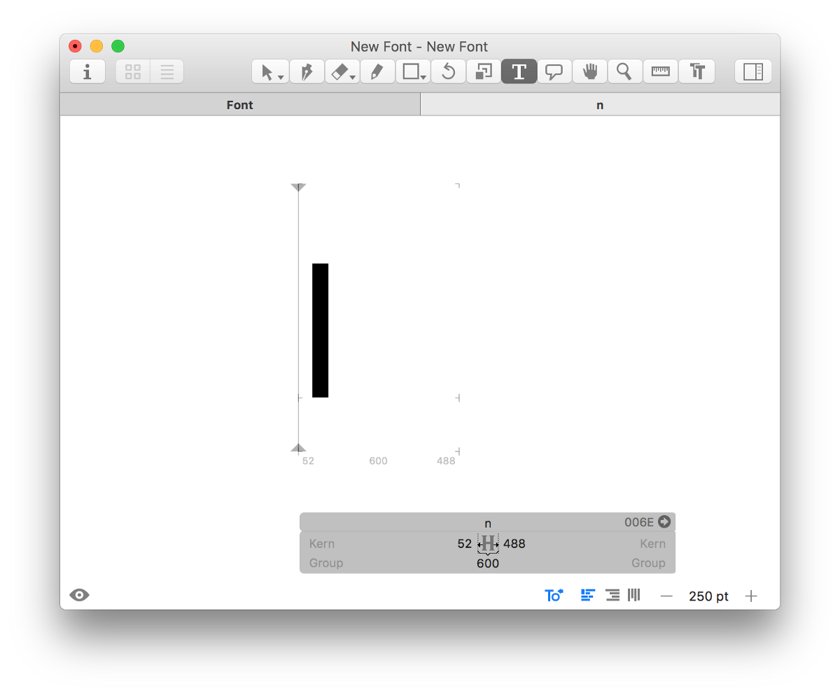
Start with your first piece — a stem. Just for fun, because we love naming, we’ll call it Stem 1.
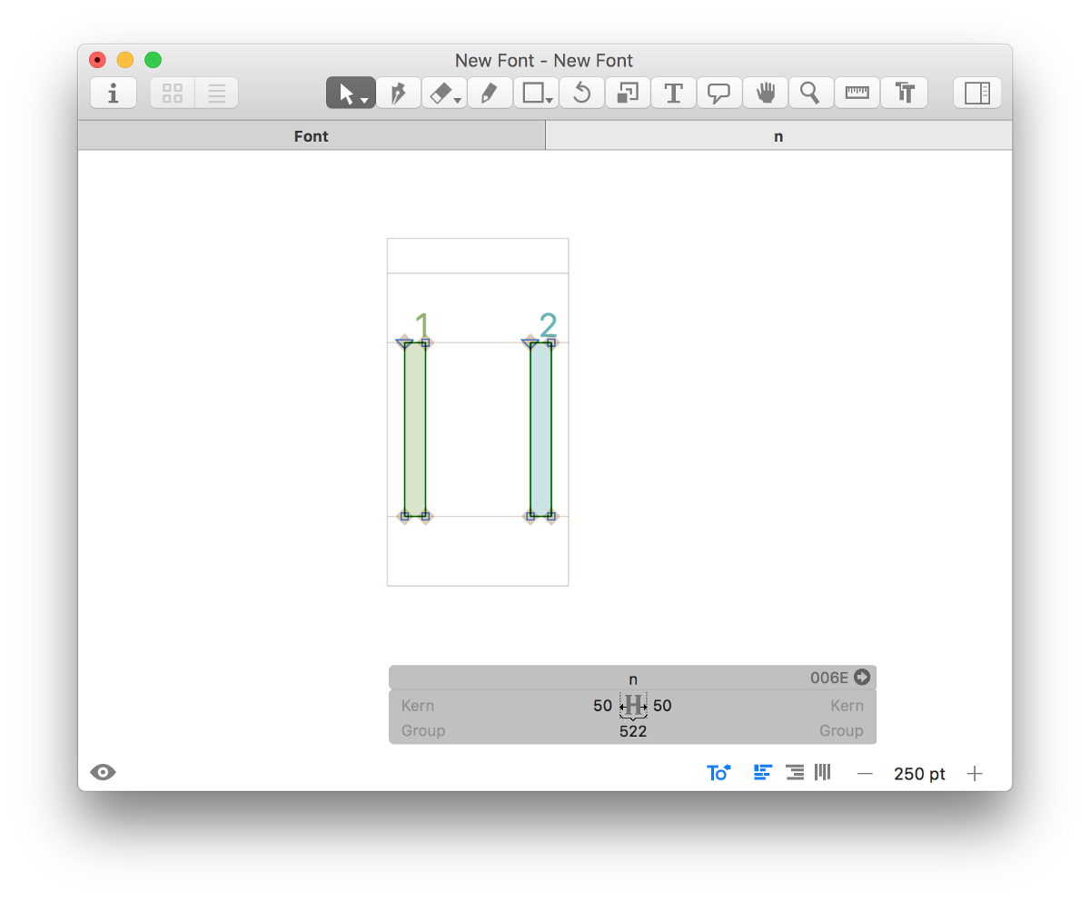
Add a second Stem. Let’s call it— go with us on this— Stem 2.
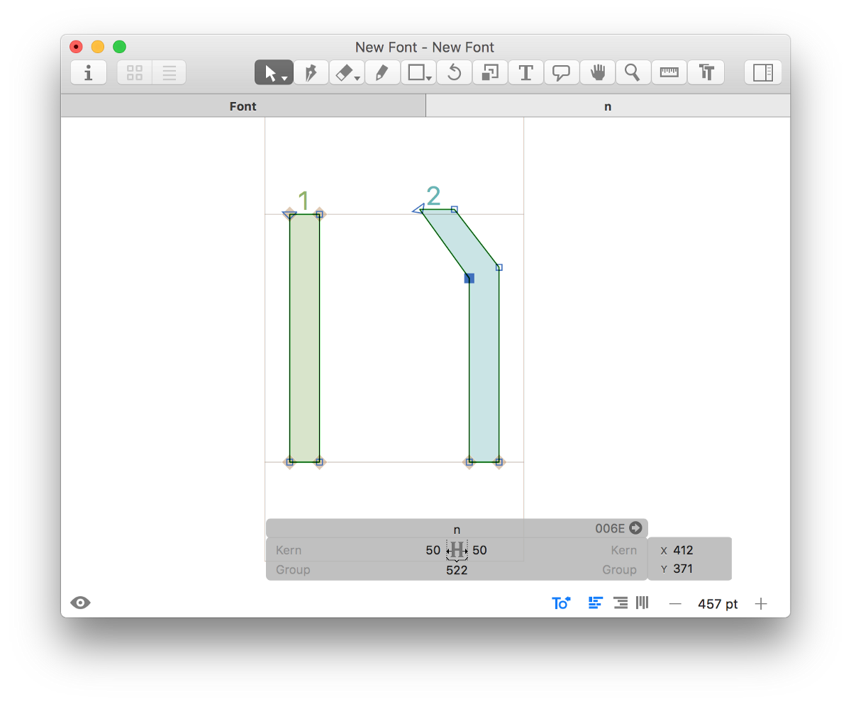
Let’s start getting crazy; we’ll add a transition connecting the two stems — in two simple steps. Start by bending that handsome Stem 2 into what we’d call a Shoulder. It’s fine if it’s rough, we’ve got the rest of our lives to make it better.
Now let’s get real nuts — extend that sucker back towards Stem 1, and suddenly we have what the cool kids call a Joint. Desperately holding back any Seth Rogan jokes, we’re now suddenly looking at something that sure as heck looks like a lowercase ’n’ to me:


It may seem basic, but let’s recap what we’ve learned through this simple, anatomy-lingo-filled drawing so far. We can confidently say that a sans-serif, lowercase “n” is composed of 4 components:

The stem
- Stems, our examples of Stem 1 and Stem 2
- Joint, which connects Stem 1 to the Shoulder
- Shoulder, which connects the Joint to Stem 2
With those atomic pieces, now comes the part where we put on analytical hats, and consider what happens when we mess with stuff, like designers do.
We’re Designers — Let’s Play with Contrast
As a great teacher once taught us, one of the core pieces of analyzing design is to mess with the relationship between affinity and contrast. Design is all about experimenting, so we can see how differences speak to whatever your intentions are for the thing you’re designing. We learn tools to mess with stuff & experiment, so we can find the right amount of expected vs. unexpected.
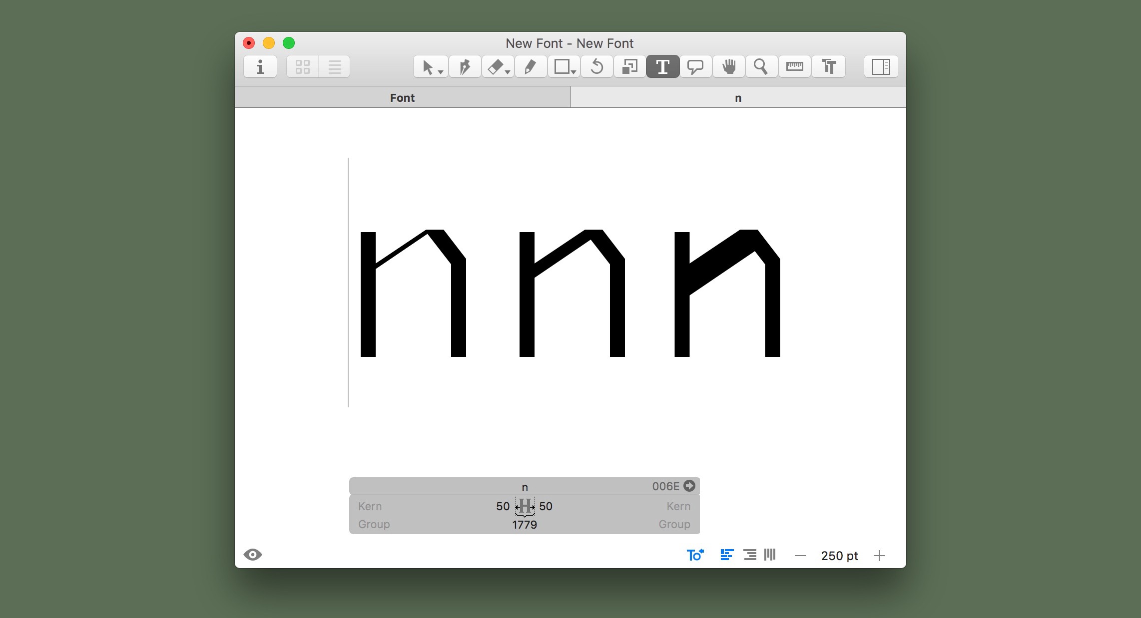
Mess with Thickness
Now that we know these fundamental pieces, let’s see what happens when we fiddle around with the thickness of Shoulder vs. Stem.
Heck, let’s mess, too, with the thickness of Joint vs. Stem.
Mess with Connections
We can go a different direction, and start considering the Branching of Shoulder vs. Stem, changing where and how those pieces connect.
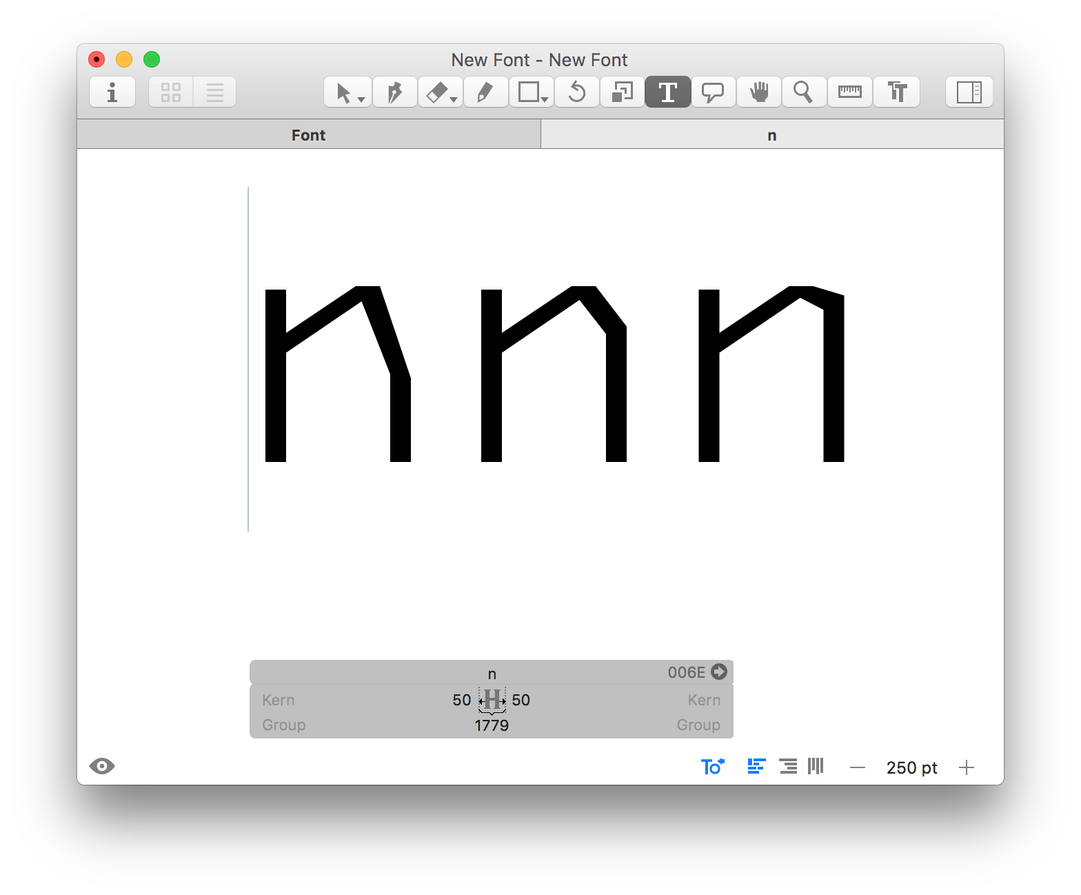
And if that’s interesting, why not the Branching of the Joint vs. Stem?
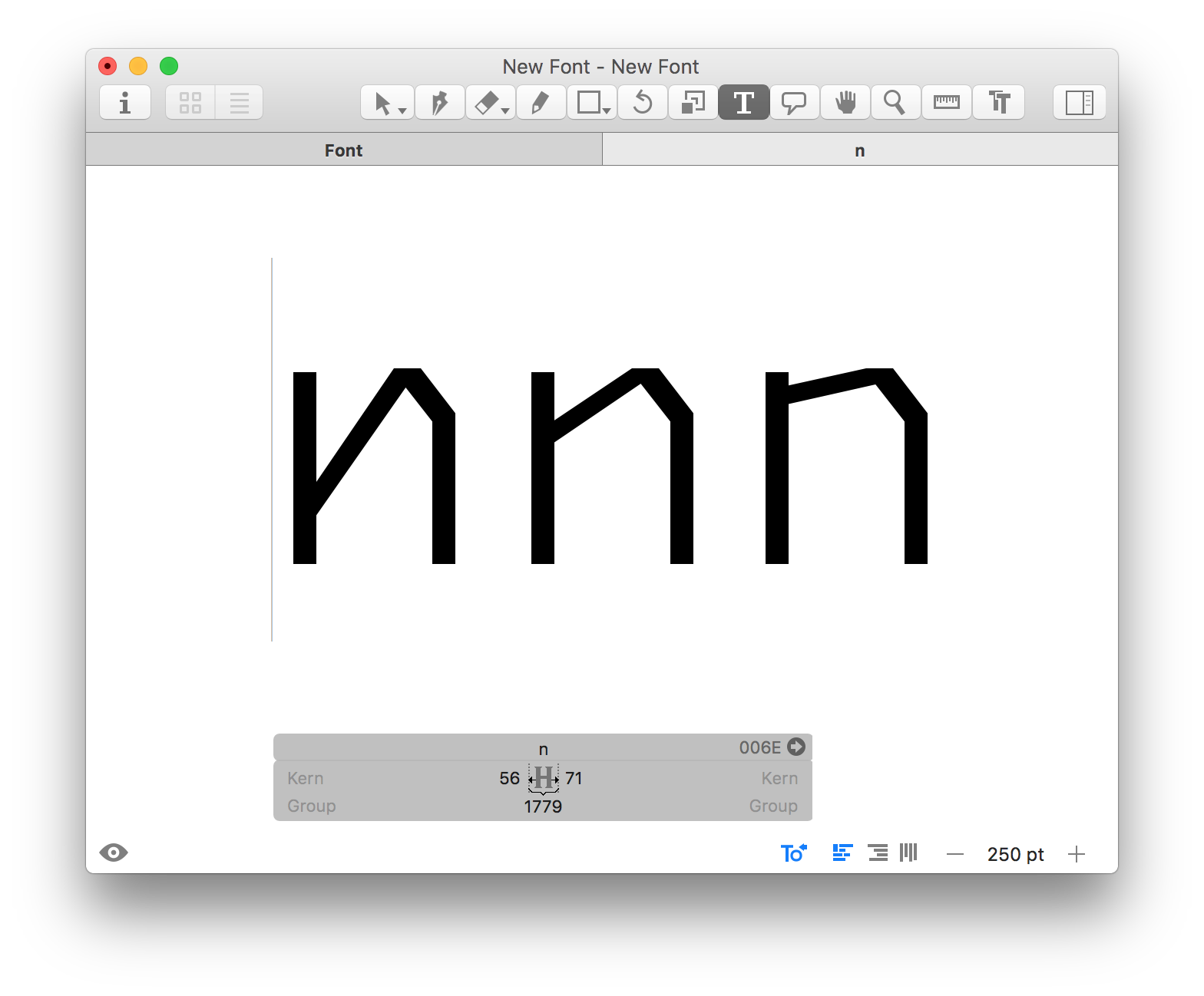
Mess with Proportion
The Thickness of the Stem 1 and Stem 2 determines the Weight of the letter.

Weight vs. Width of our sweet new letter
That beautiful negative space between the Stems, called the Counterspace, determines the ultimate Width of the letter.
Do we need to modify the Stem 1’s top to deal with the Joint and Stem? What about playing with the angle of the shoulder, based on the weight? How does each of these variations affect your overall perception of the type, and of whatever you’re designing, for how you intend to use it?
Holy crap, we’re suddenly considering how the atomic elements of a font can affect our end goals for the whole design — the options are suddenly endless, and suddenly available to us.
If you’ve been following along this example with us, notice how flipping quickly we made a letter. Also notice how many design decisions you made with just that one measly little glyph — both on purpose and by default.
Simplicity becomes full of depth very quickly, sure — but with the right mental framework, you can do this.
Let’s continue.
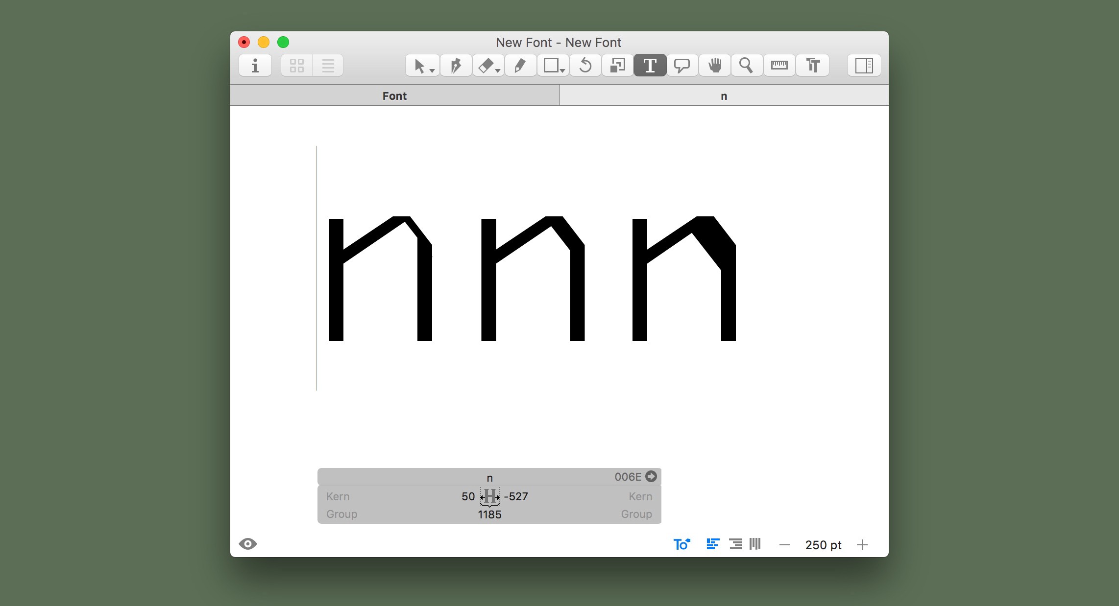
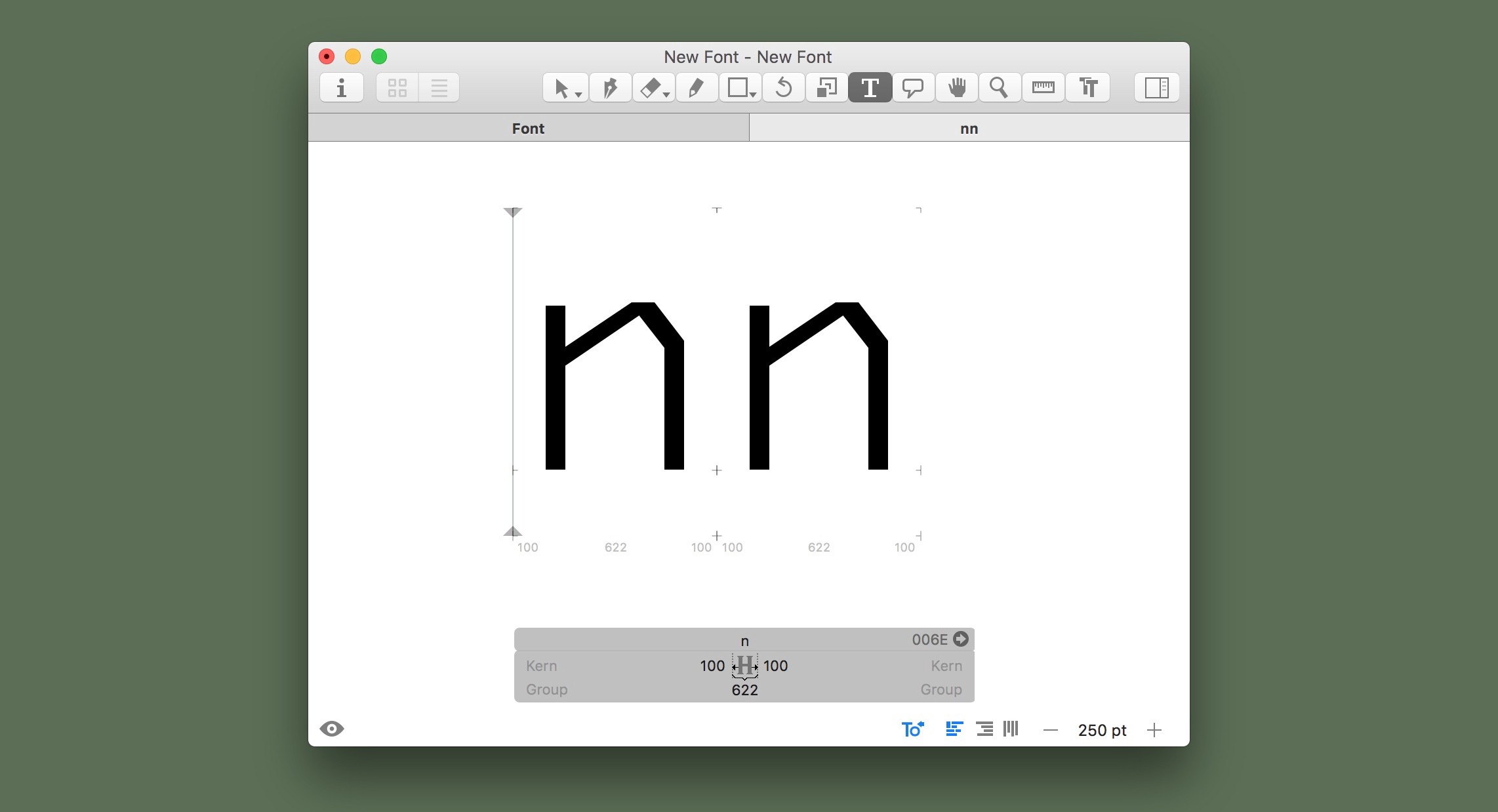
Time to Double Down — get those letters next to each other.
Don’t freak out, but we’re about to get real up in here — type two “n” out on the page. Like, next to each other.
The space between the two “n” is the Letterspace.
White space has its own components, and are just as important as the shapes you intentionally draw. As Cyrus Highsmith said:
If you can train yourself to see and think about white space and how all those different kinds of spaces relate to each other, you are off to a good start.
Couldn’t agree more.
Now, we’re all about building on what we’ve learned, so let’s bring back something we talked about earlier — compare the Letterspace we just talked about, with the Counterspace.
 Too narrow? Too wide? We’re starting to get this analytical ball rolling, I think.
The Real Point — Your Application Determines Your Decisions, and Those Decisions Affect Your Result.
Ok, time to be serious.
Your intended usage for this type will determine the appropriate decisions for how your components relate to one another. The headline masthead for a magazine is very different from small text on a chart.

Notice how components are mirrored from the Latin to the Kanji. Affinity + Contrast.
Worth reading a little more, check out insight Tien-Min Liao shared in a favorite TypeThursday interview, how to harmonize latin with kanji uses this model of thinking.
But this is the core fundamental of working with type. These decisions are not based on subjective taste, but instead, grounded in effectiveness. These are decisions you make, whether you’re making or choosing a typeface to use. These decisions are strong enough to be understandable to others and convince decision makers on your proposed design directions. These are not arbitrary whims, but an articulated knowledge to communicate effectively.
This is how knowing typography deeply can level up your design abilities. Plus, it’s kind of fun making our own letters, with our own decisions — right?
Next Steps
This post is just the start of your journey to understand and master typography. If you liked this, you’re going to love this first League course — Type Design 101. It’ll literally be made for you —live and online, over the course of 12 super interactive livestreamed weeks.
We opened the doors to our course for pre-order already, so you can book a seat today. Being a live course, on a set schedule each week, complete with very hands-on lessons, and with additional live & interactive critiques directly with your teachers and peers — it’s on you to decide how deep you go, and how much you want to level up.
But, honestly, as with all great deals, you’ll kind of need to hurry; the pre-order window is closing on the last week of December, December 31st, so we can get started with a bang. If you’re into what we’ve talked about today, get that pre-order in before the price goes up.